The Big Design Fix (And Miss)
A UX case-study on redesigning the GO-FOOD ‘Checkout’ experience | (Part 2 of 3) | The new redesign

By Fatema Raja
You are reading part two of a three-part series. Wondering how we got here? Here’s the story so far: we were redesigning the checkout experience for Gojek’s food delivery product — GoFood.
Why did we do a design change? Because nearly 20% of our customers abandoned food in the cart at the ‘Checkout’ page. ?
What’s the reason for that? There’s a dozen of them! Read the first piece in this series for details on how we went about our research to understand users’ pain points.
Clearly, our original flow had issues. We had to change the structure to not only support the complexity of the page, but also make it seem easier and intuitive to use.
This piece is about solutions. Our ephemeral moment of joy. ??
Once everyone understood the problems, it was time to point the team towards a common vision. We knew that the main issue sprung from the user needing to perform multiple actions and verifications — on a single page.
To illustrate, below are the five components chopped from our old checkout page (that required three scrolls to navigate through).
Numerous iterations (in double digits if I had to recall the number), countless paper sketches, and feedback sessions followed. It took us another month to finally find and roll out the solution. Safe to say we kept the proverbial midnight oil burning.
The ideal solution, here we go.. ?
As described in the last post, we had identified five distinct problems with our old Checkout flow that frustrated around 20% of users enough that they abandoned their order. For each one of the problems we identified, we came up with a corresponding solution:
Solution 1 — Simplify Information
(Problem: Verbose Information)
It was time to be brutal and cut down on information density. We started off by asking a few questions:
What goes with what? Do we really need this, or that? — This approach helped us group similar content and reduce visual complexity by combining or eliminating information altogether.
Here’s an example. Our existing dish card consisted of the following components:
- Dish Name
- Dish Price
- Stepper (number of dishes added)
- Notes (added by the user)
- Dish Description
Our primary aim was to shrink the size of the card by removing or hiding redundant information and adding delight. It conjured up Maeda’s Principle of Simplicity — SHE. (Shrink, Hide, Embody).
Our redesigned dish card was laid out like this:
- Dish Name, Number (stepper) and Price: This is the minimum information a user requires to confirm the dish in the cart to move forward. So we decided to retain this as is.
- Notes: There was a huge argument about this one — some said “let’s remove notes entirely” while the others debated “ let’s do it at cart level rather than having them per dish”. But our data said otherwise: 7 out of 10 dishes ordered had notes added. This is very much a cultural nuance in Indonesia; people order in groups and want their food customised to a point that bewilders someone from the outside, like me. For example: while ordering the traditional Padang — notes look like this: (1) ayam pop, rice with ayam pop plus gulai soup plus rendang seasoning, no papaya leaves, more ayam pop sauce, spicy pleaseeee, wrap it in one pack… because people there have different preferences on the level of spiciness and packaging. Hence, we decided to retain notes, but Hide it behind a 16 x 16 button which saved us over a 100 pixels ?.
Dish Description: Technically users need the dish description before adding it to the cart (to get a sense of the taste, of course!). So, finding no use for it in the cart page, we considered removing it altogether. BUT, we didn’t want to bombard the user with too many changes in the redesign. Hence, we decided to Shrink and reveal only a portion of the description, retaining the rest behind a click. (After a lot of trial and error, we decided on revealing 3 lines max — keeping in mind various device sizes and our content quality).
- Dish Images: Our conversion rates for dishes with images was way better than dishes without images (6 out of 10 dishes ordered had images ??). To make up for the missing notes and shrunken description, we took full advantage of the saved real estate to bring in dish images on the checkout page, in order to drive monetary growth (ordered dishes) and improve business metrics. Oh, and obviously, add more delight for our users. ?Hence Embodying the dish card.
We applied the same principle to payments, delivery, voucher & billing. Obviously, we shifted through troves of data points for each of these ?. We made a few radical changes, but without overwhelming the user.
Solution 2 — Progressive Disclosure
(Problem: Cognitive overload)
Our aim here was for each component to be self evident, It was important to not only simplify each section, but also reveal them in order of relevance. Rather than throwing information at our users, we wanted to gracefully present it — to maintain their attention by reducing clutter and confusion.
Things that are related logically, are related visually.
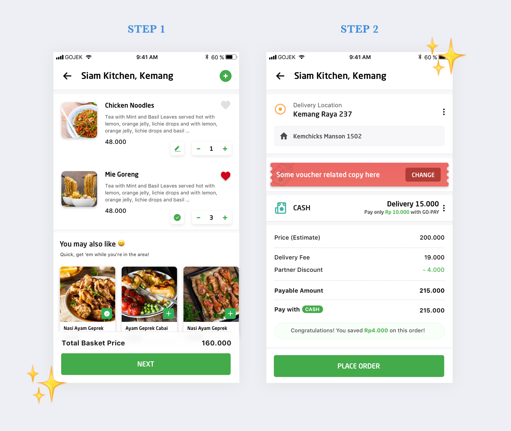
After a lot of arguments and brainstorming around user behaviour and device sizes, we locked down on the two-step checkout design — we divided the five components from a single page into two different steps.
This was a huge shift in thinking, and was going to add an element of confusion among our loyal users. Instead of taking 100 actions on one page, our fall back was to divide and conquer. A calculated leap of faith ?
Page 1 — Check dishes, Cross selling & Total price (food-related information)
Page 2 — How to pay and where to deliver (checkout-related information)
This improved usability by presenting only the minimum data required for the task at hand. It also helped us achieve the following:
- Bring down cognitive overload.
- Ease decision making.
- Free up real estate for business and monetisation (banners, up-selling).
Solution 3 — Bring down checkout time
(Problem: Prolonged Checkout)
With a simplified structure of divided steps, our on-point hypothesis was: lesser time taken to checkout ⏳. However, a lot of us also argued that the extra step might increase the time instead. So we double-checked our hypothesis with a quick usability test. Much to our relief, the two-step process showed positive signs and was proved to be faster.
click-click over scroll-scroll-scroll-click.
Another small change that saved time was to make the CTA sticky on both the steps, this saved users from scrolling all the way to the bottom to take the primary action.
Solution 4 — Reduce Cancellations
(Problem: High Cancellations)
One big way to solve this was to bring our location card in focus, hence we featured it prominently at the top on the second step (refer to the image above), and not hidden behind a scroll. This made it easy for the user to immediately verify delivery location as soon as they landed on this page, reducing cancellations caused by an incorrect delivery address.
Solution 5 — Ship delight
(Problem: Lacks love)
Shipping delight was critical for GoFood. As a brand, we were known to be fun and colloquial — we wanted our designs to reflect this trait visually ❤️
Here’s an example of how we did it:
Our old designs used the native pop-up to throw an error every time a GoFood user placed an order above our maximum distance limit (25 km). It needed some love, as we were dealing with hungry (and sometimes, cranky) minds. We tried to make this screen more fun and informative.
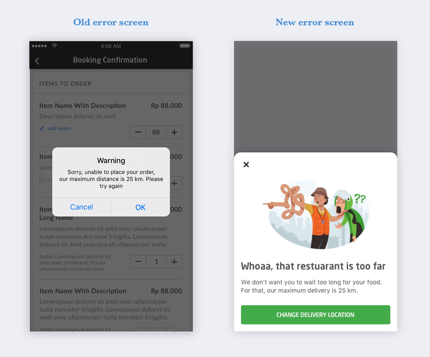
We gave our users an understanding of why we don’t do food delivery above 25 km, and added a delightful illustration that was relatable for people in Indonesia.
The above illustration depicts a very common (funny) occurrence on the streets of Indonesia. Ever tried asking for an address or direction there? Well, chances are, you will end up exactly where you started. Yeah, that happens a lot! ?
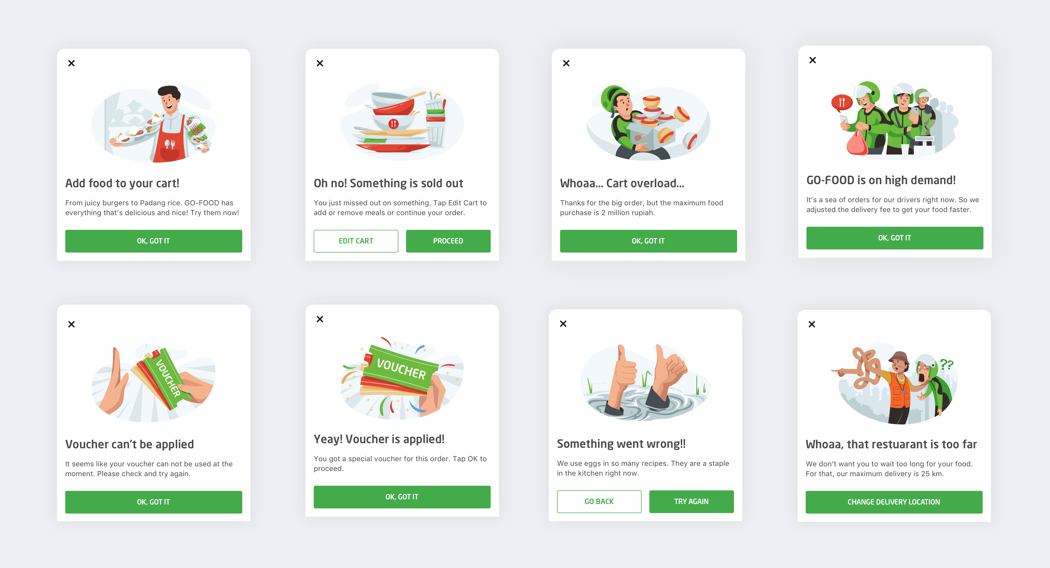
Some more examples of sprinkling love ❤
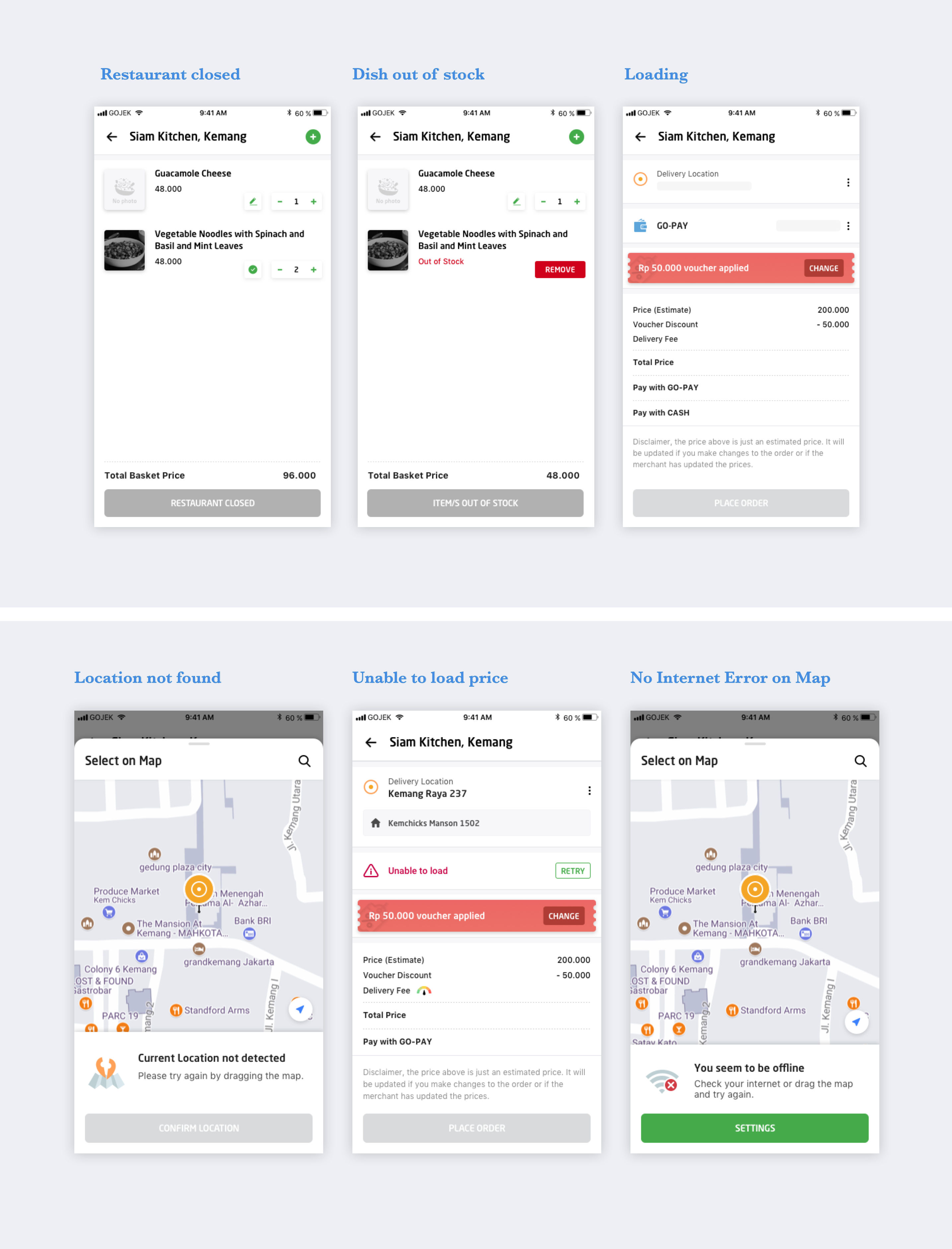
Designing for edge cases ?
Another important step (often forgotten by designers) under the redesign sparkle was solving for edge cases. It helps us reinforce usability in our designs by ensuring whatever the user is trying to do works.
“Why can’t I place my food order? Why is the ORDER button disabled?”
— From a user who added 3 pizzas to their shopping cart at around 8:45 pm and revisited the cart at 9:30 pm to place the order.
Unfortunately, the pizzeria shuts at 9 pm. But, there was no way for the user to know that since she accessed the cart directly from the homepage. ?
Solving for the maximum in the happy flow, we didn’t sweat on edge cases initially, but now that we had fleshed out our designs, it was time to turn the spotlight on our beloved edge cases . This helped reduce drop offs due to uncertainty, and increase business by guiding the user through it.
Collaborating with engineers ??
It’s one thing to have solutions in static sketch files, and a whole different feeling to see them in action. We provided the engineers with prototypes to help them paint a better picture and make our solutions more believable. ?
Another efficient way we communicated design intent was to actually sit with engineers. We did frequent design QAs — this helped us execute the expected experience and gave us the ultimate pleasure of seeing every working pixel matching our sketches.
Ready to launch ?
PHEW! DONE!!
The new design was finally ready to ship. We were super excited to hear what our users thought and how much they like our new, redesigned Checkout flow. Pats on backs for the amazing work, research, and collaboration.
This was our moment of truth. All the months of hard work summed up in this 6-second GIF ?

Going to Beta ?
Before rolling out to our millions of users, as is practice, we launched a beta version to about 50K users. This was a good size for us to understand how things were shaping up, and if we needed to go back to the drawing board.
Things seemed okay — not too good or bad, no major dropoffs, the conversion graph looked stable. Just like any good redesign, we were giving time to our users to adapt to the new change before we received the desired applause.
Instead…
Radio Silence.
Two days into the new designs
Things were not looking good. We took an entire week to collect meaningful data. We lost a few thousand orders at peak. ??
That was not normal, that was the definition of a colossal mess up… The results were the stark opposite to what we had anticipated.
By changing the UX flow on GoFood to supposedly offer a better experience, we lost thousands of bookings. A minor miscalculation in the decisions we took (well, in hindsight, major) had broken the flow for our most loyal users, and annoyed them enough to look elsewhere to satiate their tummies.
What happened?… What went wrong? ?
Read about how we identified what went wrong, and the steps we took to fix things — in the third and final part of this series.