Of dreams, deadlines, and a design system
How we created Asphalt — GOJEK’s Design Language System
By Mayank Sagar
From 17 products, 300 sketch files, and 1,200 artboards to 200 unique components
The above statement seems like something out of a designer’s nightmare. That is precisely what we had at GOJEK when we started on the journey documented in this post. This is the story of how we developed Asphalt, — GOJEK’s Design Language System (DLS) — and what we learned from our mistakes.
It all starts with scale
Rewind to 2017 — GOJEK scaled 6600 times since the launch of our mobile app in June 2015. By June 2016, there were over 20 million bookings on GOJEK — about 667,000 rides per day. From three products at launch, we had grown to 17+ unique services. Now you could order food, get beauty treatments at home, or be chauffeured around town in a car.
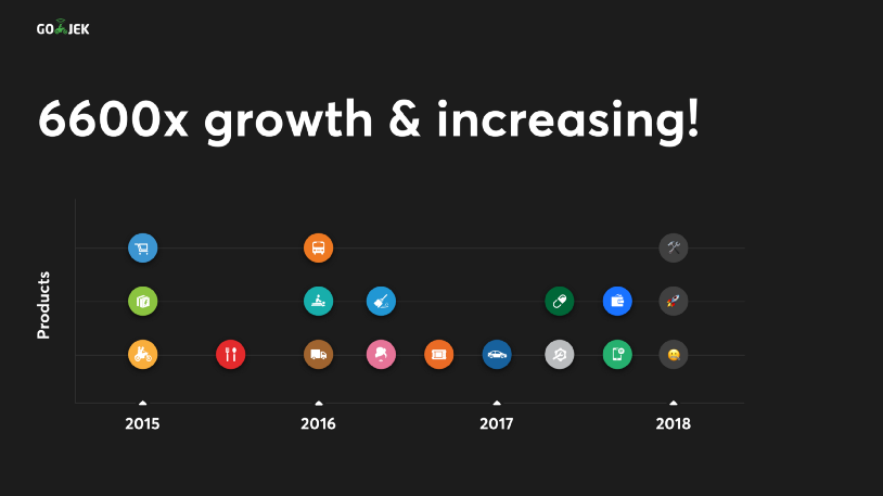
But growing at this rapid rate had its repercussions. This kind of scale put our engineering, operations and marketing teams under tremendous pressure. Design was no exception. All our products were created under tight deadlines to deliver what our users needed. This meant the designers didn’t have the time to sync with each other and keep things consistent.
We needed to fix this.
Taking stock
To understand the issues, we sat down and went through every flow of our app. Identifying problems was our top priority.
Sifting through three years worth of sketch documents was not pleasant, but it was necessary.
When we started, this is what we had 😅:
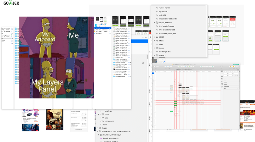
As the list of files grew, so did the inconsistencies in designs: redundant hidden layers, no grid structures, no fixed naming conventions. We had files with almost ten different ‘brand’ colors in one artboard. You get the idea.
But somewhere in this chaos, a pattern began to emerge. We could see common colors, typography, and shapes that formed the base of most of our designs. All was not lost. The need of the hour was a system where these patterns could live and evolve.
Read, re-read, and read some more
With that idea in mind, we set out to research. To get a sense of direction, we reached out to the experts in our research team. Knowing where to look is as important as knowing what to look for. Part of our exercise also involved looking at what other organizations were doing to tackle the same problems. We looked at design behemoths like Google, Apple, Airbnb, Atlassian, and IBM. The list is endless
After months of research, we realized that a DLS is what we needed. As we dug deeper into this concept, reality started to dawn on us — design systems are hard. Everyone wants them, but no-one wants to do it. They need a lot of investment in the form of time, people & resources.
Design systems are not a side project
You need a dedicated team whose full-time job is to work on creating this system, day in and out. This is where we made our first mistake.
We started with two designers
There is a very fine line between bravery and stupidity, but we took the plunge. Thankfully, we survived our mistake. To give you a glimpse, this is where we are now:
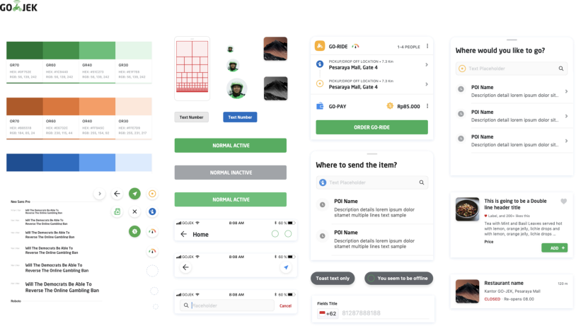
It took us a total of 14 months to get here. We currently have 200 unique components which are being used across 700+ screens
On to the big question — How did we manage this?
“If you want to eat an elephant, take one bite at a time” — Creighton Abrams
This famous quote formed the baseline of our process as well. We broke the task of creating and implementing this new system into multiple smaller parts:
1. Get a buy-in
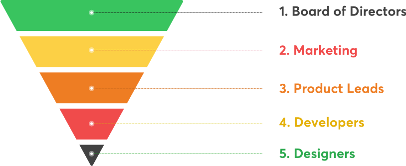
One of the most challenging jobs is getting approvals on ideas from the team. We as designers/developers face this challenge every day. You generally start from the top of the pyramid and work your way down. At least, that’s how it usually works.
At GOJEK, everyone is expected to walk the talk, and we take ownership of our projects. Instead of taking our ideas and selling it to the people on top, we started at the bottom — fellow designers from the team and developers across the organization. This was the most critical factor. Once we had the team on our side, we were confident we could pull off the first phase of the revolution.
2. Pick a development mule
The next task was to pick a product to run our experiment on. It was essential to choose the product with the most varied use cases. This was done so that we could cover the maximum possible problems which we might face in the future. Sticking to the definition, we picked GO-RIDE as our development mule. The reasons being:
— It had the most reusable aspects to it, as most of our products were based on sending things from point A to B
— It was the biggest in scale. We had almost 1.3 million orders per day when we started. That naturally led to GO-RIDE being the product with the highest impact to GOJEK
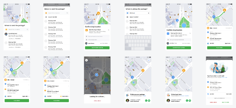
To give you an idea, these are just a few of the screens from the whole flow:
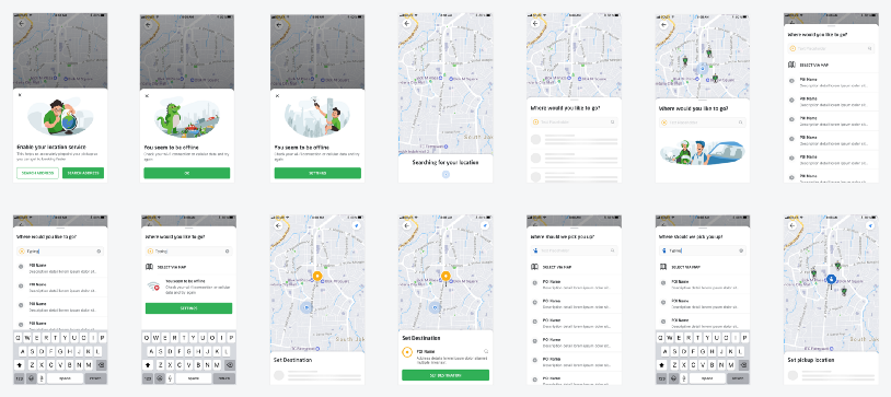
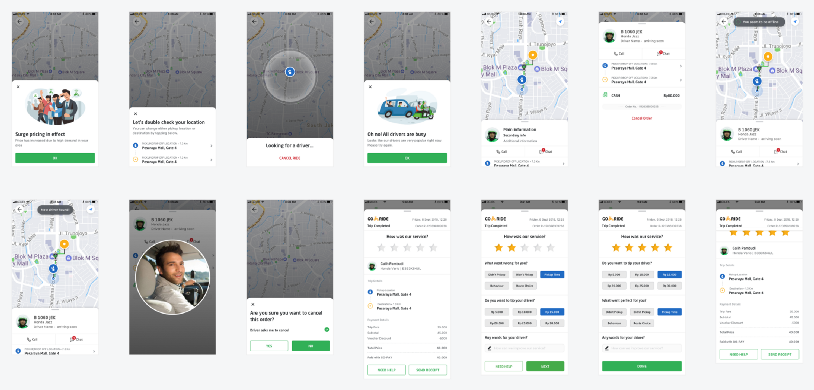
As we neared the finish line of our experimentation with GO-RIDE, we started seeing few common patterns across the product. There were many components and flows that occurred multiple times within the product itself. We began documenting them, and this formed the first style guide for our redesign.
But a style-guide can only do so much.
What we needed was a system that could utilise this style guide and churn out coherent designs, efficiently
To create this system, we needed to first ensure that our style guide translated across our other products as well.
3. Share the learnings
The next step for us was to get the other products on board. Armed with the style guide, we approached the other three big products — GO-FOOD, GO-PAY, and PLATFORM.
One thing we decided before we ran our experiment was to do it one product at a time. The main reasons being:
— The sheer scale of GOJEK as a product was so massive that getting a new language rolled out in its entirety would have taken a long time.
— We were learning as we were designing the language ourselves.
Running our experiment meant that every team was now expecting our system to perform, and perform well.
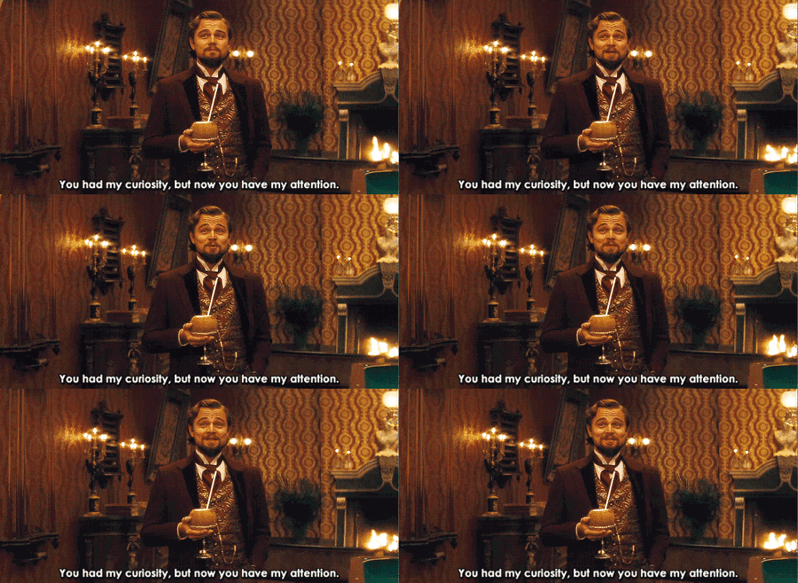
Now, this is where things get interesting
These are some designs from the new GO-FOOD. It took us a total of six months to get here:
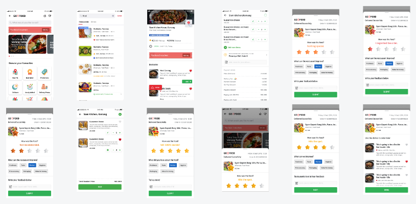
Using the same components from GO-FOOD, we created designs for another product, GO-MART. Guess how much time it took us? We were ready with production ready designs in just four weeks.
Similarly, it took us roughly eight months for our initial GO-RIDE redesign. Using components from this to make designs for GO-SEND, we finished in just… two weeks.
Seeing these impressive results helped us get noticed by not just the teams we were working with, but the entire organisation. Everyone from engineers and designers to product managers and top management was now talking in terms of components, not screens.
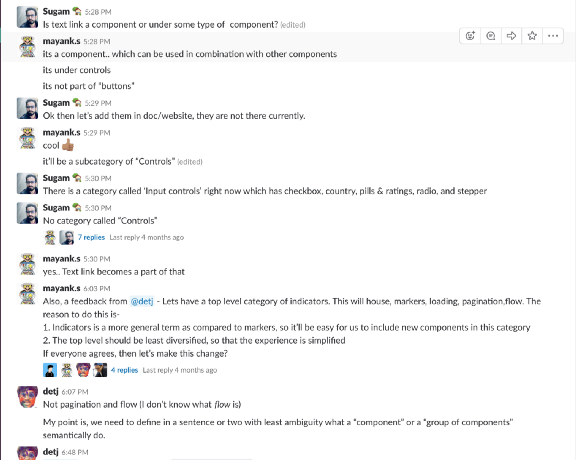

It took us a while to get here, but we knew we were heading in the right direction. This boosted our confidence, and all product teams started reaching out to us.
4. Improve results
The results became an involuntary result of using our system. Apart from an improvement in speed, the number of app crashes also came down. Since these components were being reused, their code went through multiple refactoring cycles and significantly improved our app stability. To give you an example, app crashes in GO-SEND halved as we were using components from GO-RIDE.


5. Finish the job
It was now time for us to go in for the kill. We had all the positive results and data to support our system. All we needed now was to get the top management onto our team. We needed an identity.
“Salam Satu Aspal” is a common saying among drivers in Indonesia. It translates to “The road that unites us all.” We realised this was a very apt metaphor for our design system, which also aims at uniting all our products.
That is why we decided to call ourselves the Asphalt team.

We were now officially recognized, with the freedom to grow and experiment. Our dream had become a budding reality.
But our work was not yet done 😅
Before we could officially celebrate, we needed to get all our data and learnings up and accessible. Since GOJEK had started to go global, having information available to everyone at all times was important.
This is the second mistake we made.
Instead of documenting from the start, we began doing it at the end. Collecting data and learnings from people is a tough ask. We started recording every single thing that we did. The designers and devs were collaborating to create the final draft of our website. The creative writers and illustrators got together to make a tone of voice, as well as an illustration library.
We didn’t limit our efforts to design. We went ahead and created some exciting development tools that could be helpful to the organization as a whole. These tools help us solve problems like internationalization of our UI, removing unwanted assets from code, and exporting multi-resolution assets. This is what makes our DLS special. We went all the way.
After countless hours and discussions, we finally managed to get Asphalt 1.0 up and running.
Notice the version number, as it’s always a process of learning and growth for us.
Here is a list of key takeaways from Asphalt’s journey:
1. Don’t spend too much time worrying about buy-in. Start as small as you can, learn more, gather data to support your argument and then go for the kill.
2. Involve engineers early. The code is a fundamental part of a design system. Engineers bring a different mindset and a lot of discipline to the process.
3. Start documenting from the word go. It always helps to have something to look back to
P.S. — I’m looking for designers to join our team at GOJEK. Hit me up at mayank.s@go-jek.com if you’re interested
Marrying a beautiful design to delightful products is one of our many specialties. As we grow across Southeast Asia, we are always looking for innovative ideas and people who aren’t afraid to shake up the status quo. If that sounds like you, 🏃♀to gojek.jobs and help us design better products.