Ka-Ching! Designing To Encourage The Habit Of Tipping
How we designed to evoke empathy and help driver partners in times of need.
By Vaibhav Bhasin
What usually encourages you to tip? Do you have a big heart? Is it the satisfaction of the service you receive? Or is it the social pressure that leaves you no choice?
Whatever the reason, you earn some good karma whenever you tip a service worker, especially during this pandemic, when their incomes are severely impacted.
In March, our driver-partners’ earnings reduced to 40% of what they were before the pandemic. While they’ve been working tirelessly to make their ends meet, any small help would make a difference.
The easiest way for customers to help driver partners? Tipping.
Although, tipping isn’t cultural in some countries. In Indonesia, for example, GoCar and GoRide have a tipping feature where customers can tip with GoPay after the trip ends.
However, our data says that over 90% of our orders don’t receive tips. 😟
This brings us to the burning question...
Why don’t users tip?
Is it a discoverability issue? Or is it because of the usability of our feature? Or is it the intent?
To figure this out, we dived deep, talked to our users, and tried to understand why they tip or what holds them back.
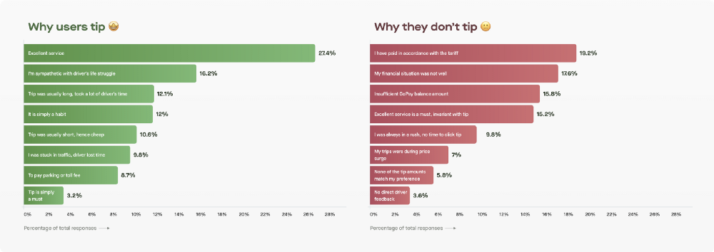
The reasons in favour of tipping were obvious:
Some tipped because of empathy towards the driver, some as a token of appreciation, and some simply as a habit.
However, when it came to not tipping, apart from the visibility and flexibility of the feature, almost half the reasons actually indicated that our users weren’t aligned with the true essence of tipping, which helps the drivers. They still thought of tipping as a very transactional act.
But that’s not all, we dug a little deeper and compared our tipping experience with the physical world and found something really interesting.
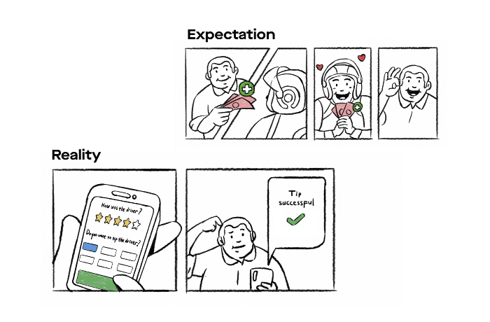
Turns out, it’s not just the lack of empathy. Our app experience was missing a very important aspect of tipping: Driver’s gratitude. Customers yearned for the satisfaction they got from the simple smile or thank you from the driver while tipping in cash. Going digital didn’t make them feel like they made an impact on the driver’s life.
The digital tipping experience took the human aspect away.
To ensure driver-partners’ earnings were increased, we realized we had to inculcate a habit of tipping in our users. And to do this, all emotional voids in our app experience had to be filled.
Thus, we needed to work on 3 major themes:
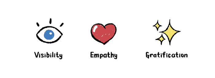
- Provide flexibility and visibility to the feature
- Establish empathy for the driver-partner
- Provide gratification to our users
How design contributes to fulfil our goal
To be honest, we really miss those design board brainstorming sessions at the office. Since we’ve been working remotely, we tried to replace it by creating these pen and paper wireframes.
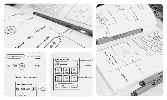
We explored multiple options. But, since we wanted to roll out a quick first milestone, we tried to come up with the Minimum Loveable Version that could be built quickly. Here’s what we did:
Provide flexibility & visibility to the feature 👀
This was probably the easiest to solve. Earlier, users could only tip at the end of high rated trips, which resulted in a lot of users either forgetting to tip or not even realizing there was a tipping feature at all.
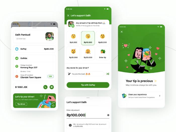
To solve this, we made tipping available across the on-trip experience. We tried to send lovely reminders through push notifications or casually showed a banner during the trip to remind them that they can tip while still being OTW.
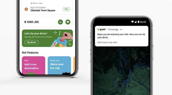
We even allowed users to tip after trips, for over an hour, so they could tip even from the comfort of their homes. Custom tipping amount options were also added to provide flexibility and convenience to the users.
We were pretty confident about these solutions. But, the challenge was the next stage since we had to…
Establish empathy for the driver ❤️
Empathy is the core essence and motivation of tipping. In order to harness this motivation and drive more tips, we decided to keep it as a primary element in our experience.
In addition to humanizing the drivers further by using their names and smiling pictures, we dedicated an entire section to talk about how hard they work and appeal to the user’s emotions.
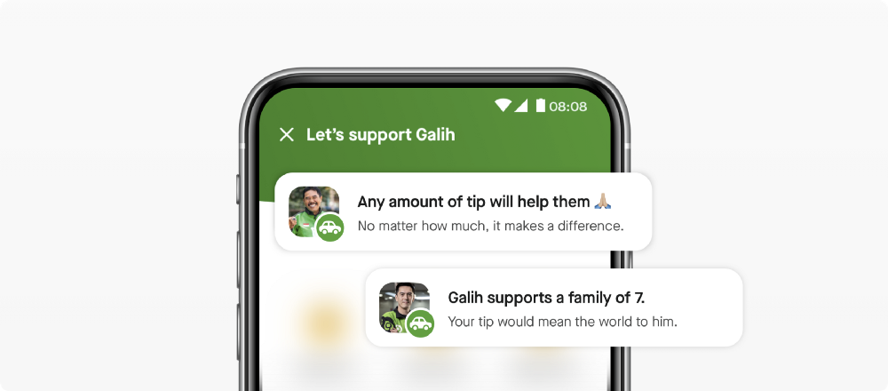
We made this section scalable to evoke empathy through the service quality and driver’s personal story.
To achieve this, copywriting played a huge role. Here’s how we went about the concept:
- The copy has to strike customers’ empathy towards the driver-partner, without degrading them.
- We wanted it to exude the impression of the Indonesian value: “gotong royong” (mutual cooperation). Tipping a driver is more about supporting them, and everyone can do it no matter how much they want to tip. Even if they tip Rp1.000, we believe it still means something.
Meanwhile, there was one more thing that we needed to work on:
Providing gratification to our users ✨
We as humans are subconsciously driven by returns. Whatever we do, we kind of hope to receive something in return. So, it becomes significantly harder when we want users to perform a task, such as providing feedback or tips, when it doesn’t give them back anything tangible.
The “return” of tipping is completely emotional. We needed to bump it up a bit to make it comparable to tangible returns. We used it to tackle the two big emotional barriers that our users were facing.
Firstly, make tipping lower amounts satisfying enough
Choosing to tip a lower amount may feel underwhelming for many people, thinking it might not make a huge difference to the driver. But trust us… IT DOES!
So we decided to break this notion. We tried to communicate it to our customers through copywriting that their tip would make a difference, no matter how much.
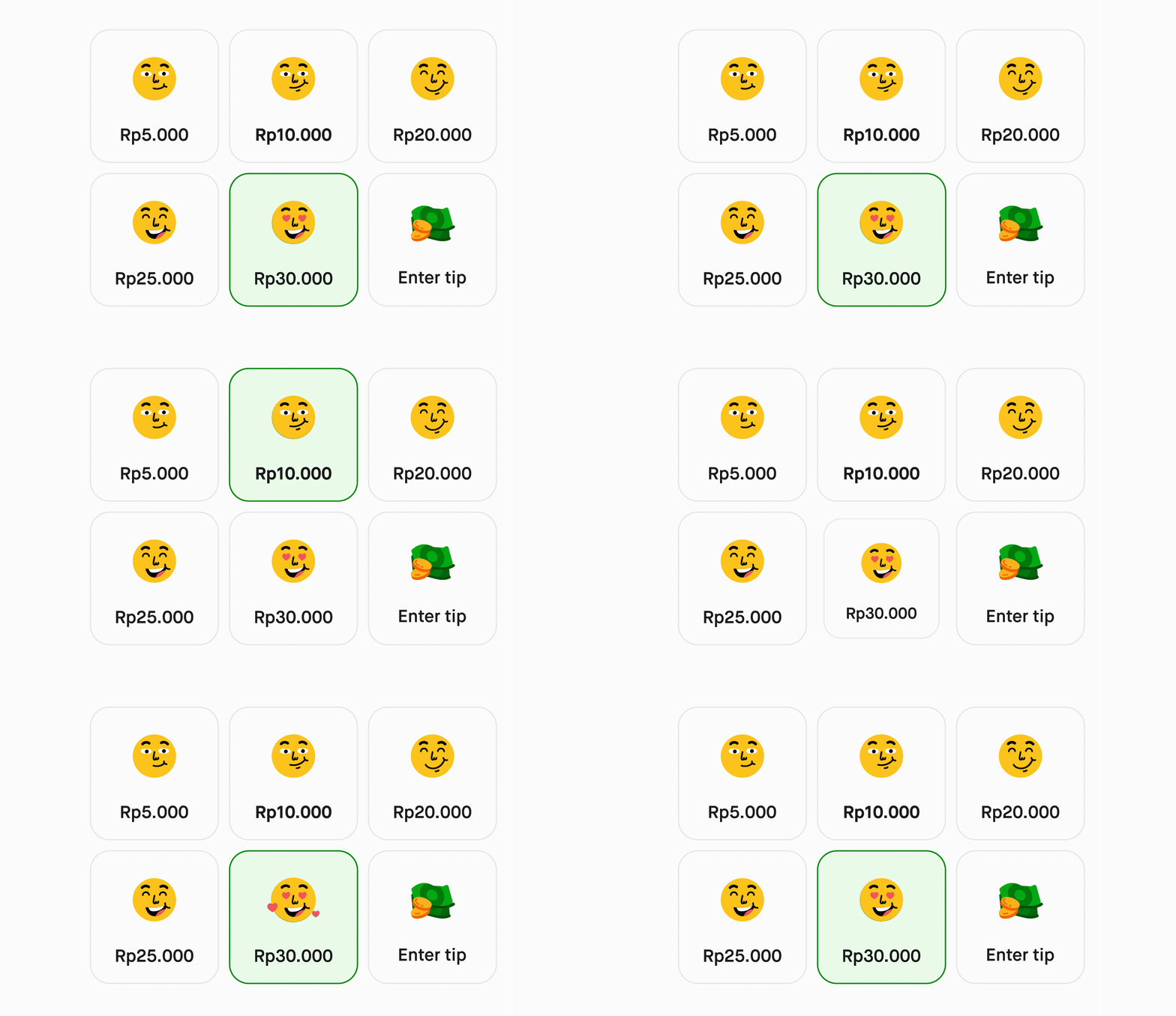
Not just that. In our tipping selector, we decided to attach emotion with every amount
This helps in 2 ways:
- We incrementally bump up emotions to motivate customers to tip higher because it would make the driver happier.
- We make even the lesser amounts satisfactory enough, since that too will put a smile on the driver’s face and make up for the lack of emotional fulfillment that a higher tip would have given.
We also added an option for our users to add thank you notes for the drivers. This ensured smaller amounts were not only satisfying for the users’ to send, but are also better received by the drivers since they come with a heartfelt appreciation.
Yup, we didn’t forget there are two parties involved. Remember it’s “mutual cooperation” 😇
If you’re thinking thank you notes would make customers drop off since it’s an additional task, it didn’t quite go that way.
We added a lot of pre-filled thank you messages for users to choose from. This reduced the effort on the users’ end because they didn’t have to think about what to type and could use the shuffle button to see awesome personalized messages pop up, and go with the one they resonated with.
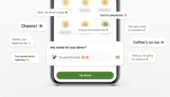
^ pick your fighters :P
Secondly, make the user feel good about tipping
We want to give customers the satisfaction of creating an impact on someone. We needed to make up for the lack of physical affirmations such as the smile on the driver’s face and the warm thank you. That’s the reason why we added this gratification screen:
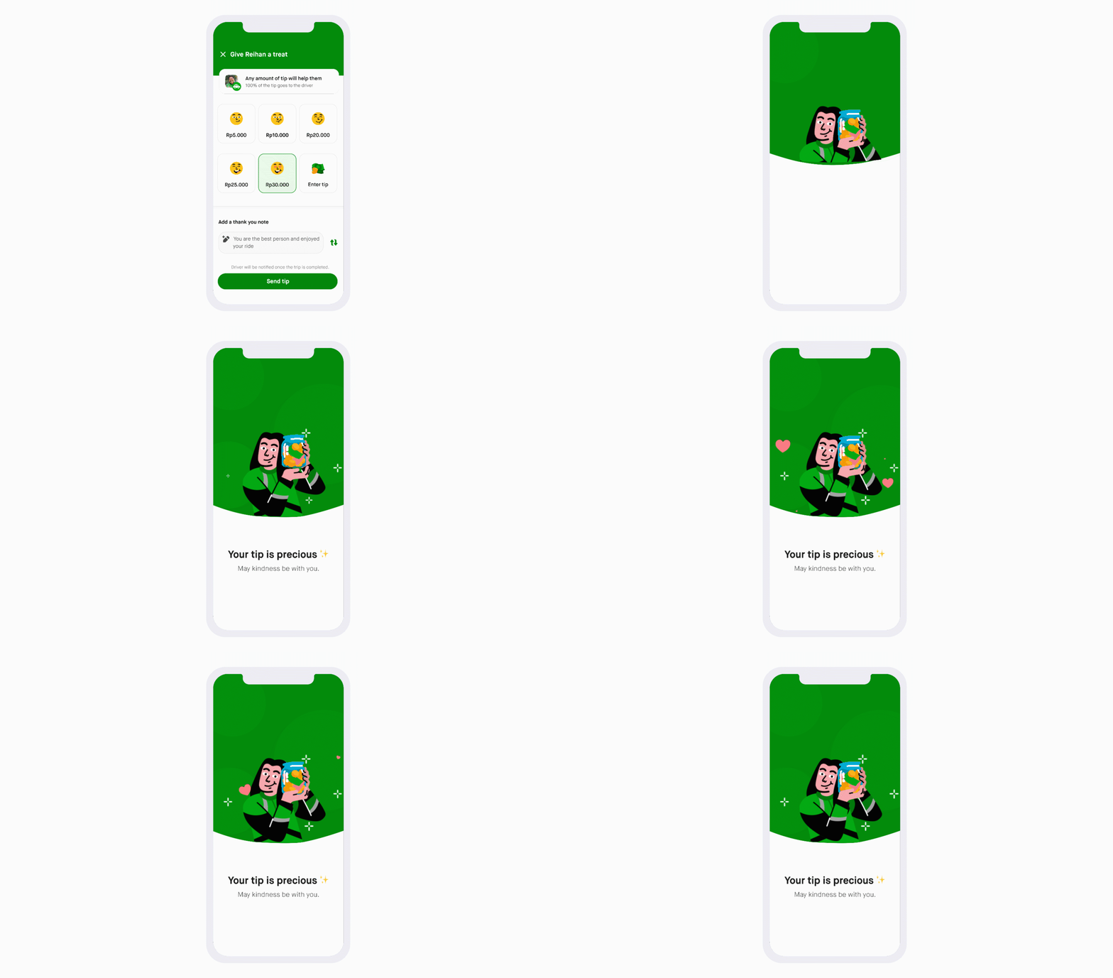
The animation paired with the copy is designed to make the users feel special and give them something to take back, go about their day feeling happy about helping someone and making a difference.
To make this experience multi-sensory and as close to the real world as possible, we added the sound of coins falling into a jar.
We tried to make tipping, which earlier on had a very transactional feel, into an emotional experience for our users.
Did the new tipping experience work?
This first milestone of our experience has been live for just a couple of weeks now, and we’ve already been able to see an increase in our average tipping amounts by almost 100%.

Yup, double. 💚
But does that mean our project was successful? Does that mean all our hypotheses were true? We’ll dive deep into the analysis in our next article. Great things come for those who wait. 🤷♂️
It’s always exciting to work on features like these, which along with impacting drivers and their livelihoods, actually deal with the softer aspects of designing something such as developing habits, establishing empathy, and most importantly, making users feel something.
That’s the beauty of Design.
Do you also feel the same way about design? If the answer is yes, do check out open positions!
See you in the next part of this article. Stay tuned.
Shoutout to Vinay, Min Han, Manyu, Jean, Alverta, Beny, Iyas & Service-excellence devs for bringing this to life. ❤️

Curious to know how we build our Gojek #SuperApp? Here’s how!
