How we used design to reduce time taken to order food — 2
A UX case-study on how & why we redesigned GoFood’s menu navigation — Part 2
By Fatema Raja
You’re reading Part-2 of a two-part series. ICYMI, here’s Part-1.👇
 4 min read | Jul 07, 2020Share:
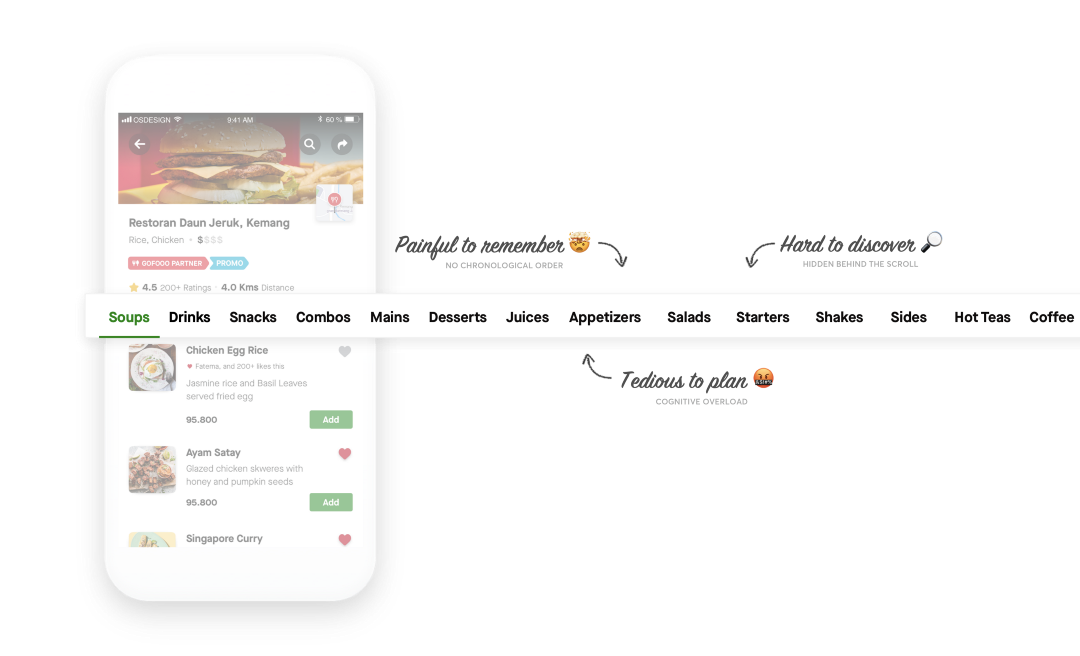
Long story, short: Nearly half of our users who landed on the restaurant page dropped off. For the other half, the average time to place an order was as high as 12 minutes 20 seconds, with nearly 7 minutes spent on the flow — from restaurant page, to final booking.
We spotted a pattern, and according to our observations, most users struggled with browsing through the menu to find the the dish they wanted to order. They were losing patience, and we were losing orders. This needed to be fixed.
Design was roped in to change this behaviour. This blog highlights how we redesigned the food menu in GoFood. We knew browsing was the biggest pain point and for that, we needed to enhance the navigation and have better indexing.
Here’s what the old menu looked like:
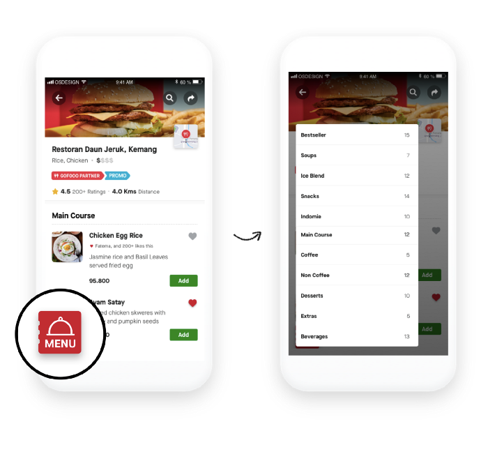
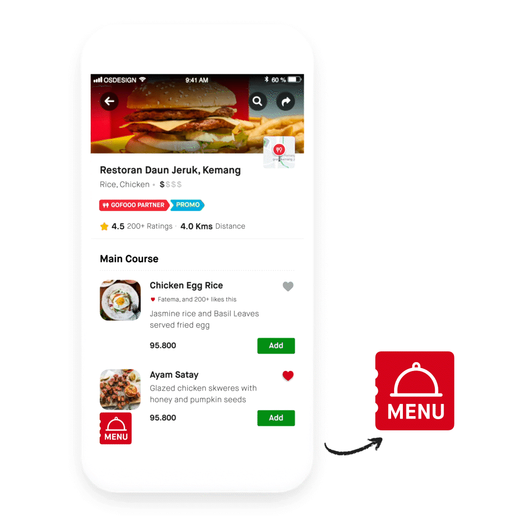
After spending days and nights iterating and testing, we had a new menu design: The ‘Floating Action Button’ (FAB)
It was clothed in our defined principles — simple, obvious and accessible.
With our new FABulous menu, it was easy to compare and browse through all available categories of food in just one click — A simple index to the food menu. No more surprises! All categories upfront.
What this fixed? Our hypotheses:
- Solved for discovery: We could show a large number of items all at once.
- Solved for recall: Doesn’t force a 1-by-1 focus on the user, to remember and recall the serial positioning.
- Solved for anxiety: Allowed the user to consume large amounts of data in a short time.
The launch 🚀
We rolled out the new design to 10% of our users. Fingers crossed 🤞, eyes glued to the dashboards 👀. We closely analysed how users interacted with the design, hoping to successfully reduce:
- Time taken to place an order
- Number of drop-offs on the restaurant page
It’s important for us as designers to stay curious and active post launch — as much as during the design phase.
It helps us see the impact of our design, for this is the time when we will be able to validate our hypotheses or learn something new about our users’ behaviour. Typically, we designers are so excited to solve the next problem, we tend to forget to measure the impact we create.
If design needs a meaningful seat at the table, we need data. To show data and the margin of impact, you get to study user behaviour for a prolonged period of time. Trust me, it doesn’t get more fun than this. 🤩
The Result 😵
If past experiments are anything to go by, we know launch days can go either way. This time, it was a double whammy. Not only did our orders drop further more, we noticed most users were not even clicking (acknowledging) the new menu button. 😢
But did this mean we failed? Not really, it was only a pivot in the process, and pivots are a sign we are learning. While the launch was important, it was only a milestone in our long journey.
Interestingly, the users who did click on the menu did manage to complete the booking faster. Bam! There it was… we were achieving at least one of the goals, and this gave us the validation we were on the right track.
But the question still remained: Why didn’t most users click on the new menu? 🤔
Well, with the new design we were forcing some of our users to change the way they interacted with our product. Changing a habit or building a new muscle memory has always been a hard to achieve, even if it is better for the user — Every designer’s nightmare with every redesign. But we had to give users time to warm up to the change. (Try convincing business that, aye? 😒)
As a designer, this is when you pick your battles. Stay the course: I cannot emphasise this enough. Not always do things go as you intended.
Most design changes do not have instant validation. They’re not meant to be comfortable, they might not even have immediate return. But, most have a longer brand or business impact when done right.
After being patient for a week, what did we see? No change!
Orders kept dropping and users still didn’t click on the new menu.
The Big Mistake ⚠️
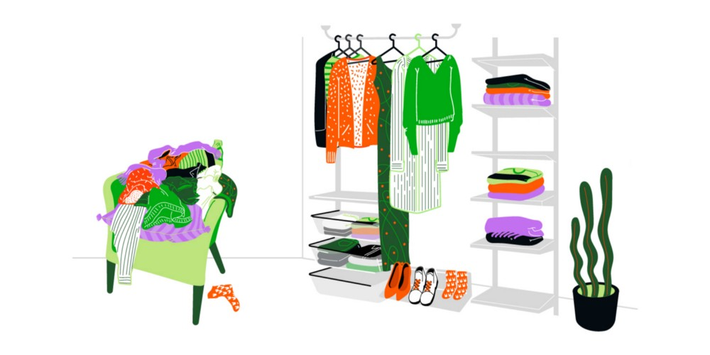
Remember THAT 👆 chair which housed all your clothes even when you had a plush wardrobe? (Yes, THAT chair). That’s a potent combination of laziness and strong behaviours.
And when your mother with all her organising skills cleaned it with utter perfection, you couldn’t find what you were looking for. Make no mistake, it was easier to find your favourite t-shirt from the pile on THAT chair, simply because you’re used to it.
Our old menu was that chair. It was messy. But was a key proxy in our users’ journey. Familiarity is a boon and bane.
But does that mean, we shouldn’t improve or change? No. Had my mom told me where she arranged what or had I done it myself, it would have been easier for me to adapt to the change and appreciate it. And that’s exactly where we went wrong.
Our big mistake: We forgot to tell our users about the change and get them familiar with the new interface. One of many things I learnt is to spend time on both designing the change and introducing it.
How you introduce change is as important as the change itself.
Our (not so) big solution 💡
We had to take users from the old behaviour to the new, and onboard them to a new menu. But introducing and on-boarding had their own drawbacks, it meant adding new elements and increasing time to place an order: quite an oxymoron to our success metrics. But it had to be done, done in a way that didn’t add friction and also gets the new menu noticed.
An instructional on-boarding would take up time and add friction. Also, from our previously done UTs we knew users could very well use the FAB with ease, since the UI pattern wasn’t alien to them.
So, instead of introducing coach marks, overlays, tool-tips which were obtrusive, time-consuming and demanded an action from the users, we decided to add a subtle animation on the FAB. This made the new design more learnable and noticeable — A way for our FAB to say Hi! 👋
This simple solution was key to increase eyeballs and direct our users’ attention. In two weeks, we saw major improvements:
We were able to reduce drop-offs and increase our overall orders by 3% in a control group before rolling this out to all our users.
We successfully reduced the overall time taken to place an order by 1 min 48 sec. (This was after 3 months of rolling out the new design)
The time taken on the flow, from restaurant page to placing an order, was successfully reduced to under 5 min from 7 min. (But yes, there were dozen other things that went into design, engineering and product, to ultimately lower this time taken)
However this was a massive win for us. 🎉🍾
Change is not an event; it’s a process ♻️
This worked for us, but is this a blueprint to be followed? Most certainly not. Cultural nuances and user research vary vastly from geography. I say this even when most navigation in food ordering apps have resorted to the FAB.
The only way to know what a possible solution might be, is to keep changing and experimenting. There are more hidden elements to measure: distribution of orders from each categories, personalisation, platform independence, etc.
So as I write this old story, we’re now in the process of yet another makeover and set of experiments to our restaurant page. Wish us luck, readers, as Aulia Agung Maulana and Ferik Tantomi bring you the all new experience of the restaurant page. Another round of ideating, iterating and understanding our different users and their needs.
What are the biggest takeaways, though?
- Spend time thinking about how to introduce a change to the users. Keep it simple.
- Stay focused post launch, study user reaction and behaviour. Keep iterating and learning
Hold on, but did this reduce the dishes and choices our users had? No.
Did it solve the problem of helping users decide faster? Well, not really.
Our users were still taking longer than *we wanted* to decide what to eat and order. We sure helped them browse faster, but did we find solutions to everything we set out to solve?
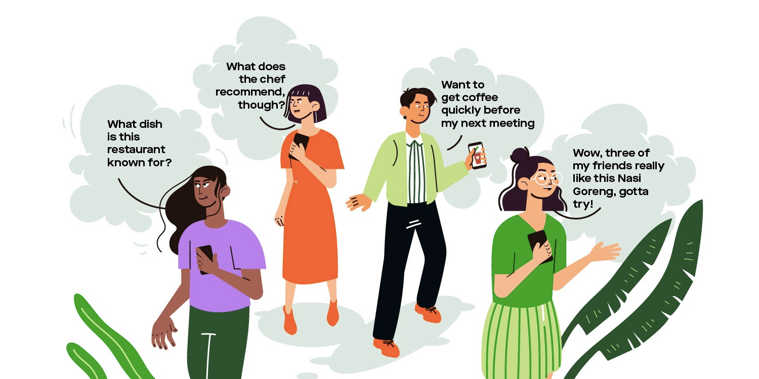
Solving UX for food delivery is complicated when you realise we’re all subjective with perfectly rational (and occasionally irrational 😝) needs 👇
Stay tuned for more stories on how we decipher users’ needs and tackle complex problems through design.

