How we make the GO-JEK app come alive
The creative process behind our redesign and a mission to give more love to our users.
By Galih Pambudi
For those reading this the first time; GO-JEK is the largest application-based on-demand service provider in Indonesia. We’re a Super App that does transportation, food delivery, logistics, payment and even lifestyle services like massage and makeup. All in one app.
Millions of Indonesians use GO-JEK, every single day. And we’ve launched in Vietnam and soon in Singapore, Philippines and Thailand. People love using GO-JEK and think of us as an Operating System that powers Indonesia.
The fact that GO-JEK receives so much love made us pause and ask ourselves:
Have we shown our users enough love through our app?
Probably not enough.
The self-reflection
We took a step back and went through what we previously had in our app.
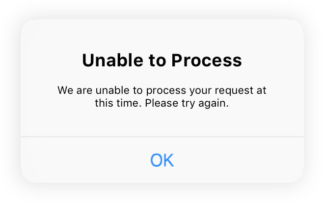
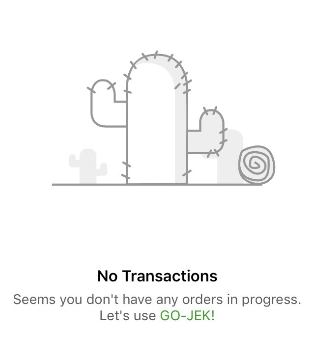
It turned out, we hadn’t been showing character and consistency across all of our products.
As a result, our app didn’t leave a memorable effect on our users.
When you can’t feel someone’s character, you can’t feel their presence. When you can’t feel their presence, you can’t build a connection, and without a connection, there is no love.
As UX writers who design conversation inside the app, we don’t want our users to feel like they’re talking to a machine. The app should sound, look, and feel like GO-JEK.
So, along with the redesign of our transportation products and the home screen, we wanted to strengthen the emotional bond with our users. This comes by giving our app a soul and character through our design; to show our users the love they deserve.
To do that, I’ve learnt we need three ingredients, three distinct functions; the brand voice, the big theme, and the stories.
Without these, we weren’t doing justice to our users.
Tuning the GO-JEK brand voice
The brand voice tells people who you are, differentiates you from the rest, and it helps build trust.
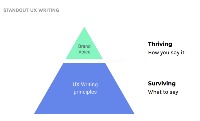
We discussed about our brand voice with other creatives from marketing and branding team to make sure we’re aligned. (I will post about how we did this on a separate article.)
Then, we broke down the details so we can apply it to any kind of use case in UX writing. As a result, these are the three main characteristics of GO-JEK’s voice:
1. Colloquial

2. Bright

3. Empathetic

By tuning the brand voice, we can define on how we should communicate with our users, in any scenario. Here is an example:
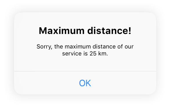
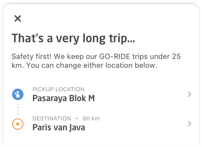
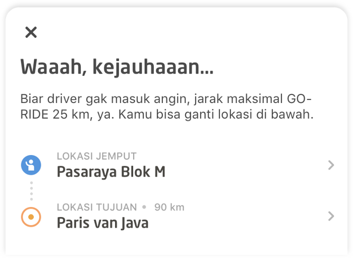

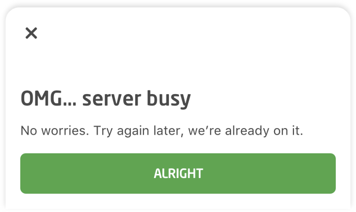
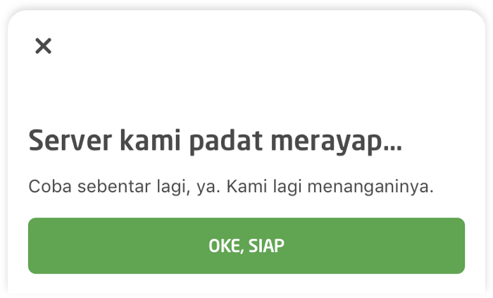
Okay, the brand voice is all set. What’s next? What can UX writers do to amplify the brand voice in our app?
Defining the big theme
The big theme is the glue that brings together the copy, illustration, and everything else in cohesion. It strengthens the brand voice, and it distinguishes us from other products.
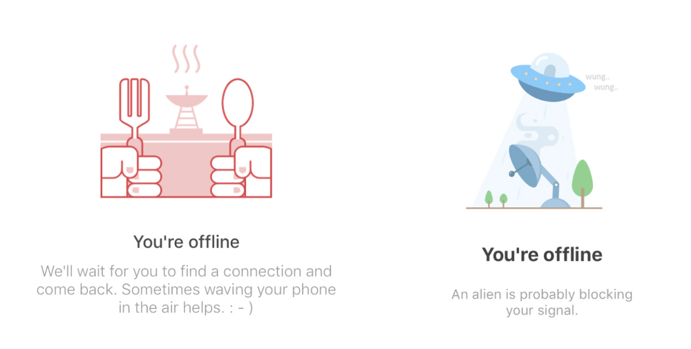
As you can see, the illustration style was different, the writing style was different, the content of the illustrations was different. Well, out of nowhere, there’s a UFO.
In order to bring everything together, we tried to find that one big theme that can represent GO-JEK.
As a product that’s dearly loved by Indonesians, we would like GO-JEK to reciprocate that sentiment as best as we can.
Long story short, we compiled many pictures and created a mood board. From there, everything started.
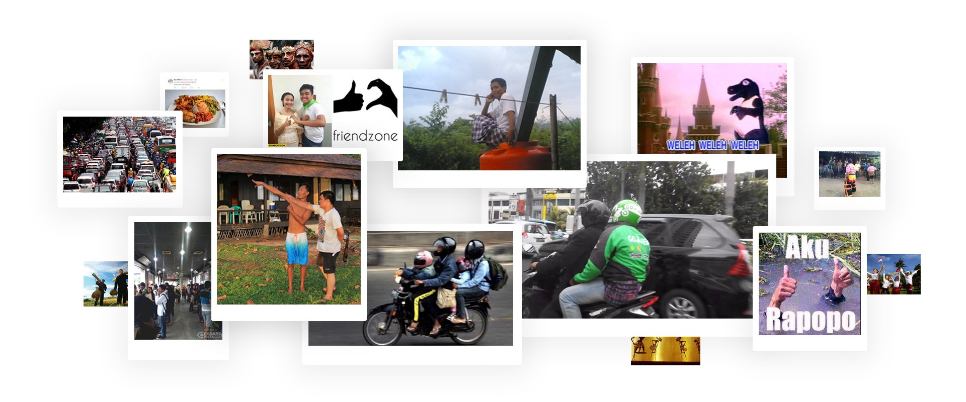
Our big theme summed up in a few words would be “The Candid Lives of Indonesians”.
Depicting everyday life and reflecting our personality of colloquial, bright, and empathetic; our theme, our copy, and our illustrations are light and cheery, mirroring settings immediately relatable to our Indonesian users which can include memes and receh jokes.
Once we nailed the big theme, we got to the best part.
Writing the story for each screen
Stories allow us to digest information easier. They make the message more memorable and help people relate better.
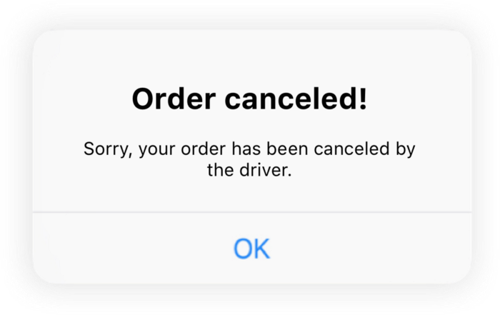
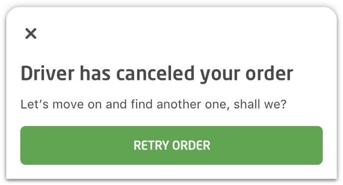
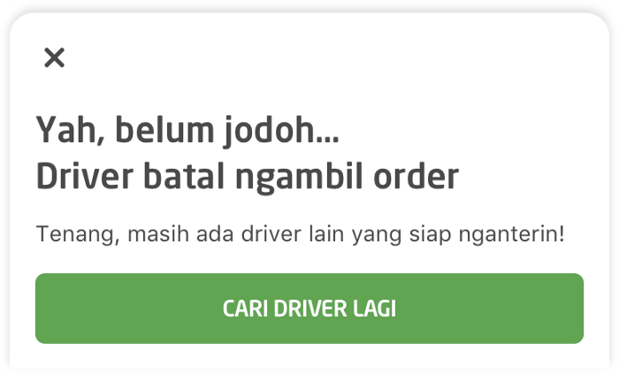
Okay, the copy is now crafted, what else can we do to make the story on this screen more powerful?
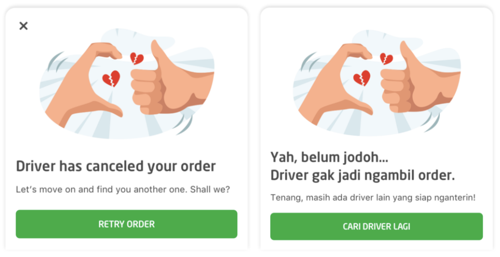
YESSSS, visual!
To complete the story, we put a ‘friendzone’ meme, which is immensely popular in Indonesia. It was the last piece of the puzzle.
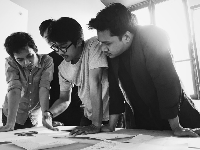
With “The Candid Life of Indonesians” as our big theme, together with the illustrator Fauzy Lukman, we gathered stories by capturing scenes, insights, jokes, and anything that Indonesians can relate to. Then, we visualize it on our app. Wanna take a look at some of the processes and the final results? Here you go.


The feedback
After a long journey, it was finally time for the launch.
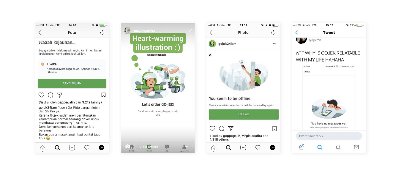
To our surprise, the feedback from our users have been lovely. Here are some of them.
On a final note
Now it all makes sense why it’s called user experience writers. Besides making a clear copy about guiding users in achieving specific goals, we also have to spur the excitement in that process to facilitate a delightful user experience.
It’s not only a matter of informing our users about what they should do next, but also how to break down that information in a manner that would “speak” to them, with the brand voice of our product.
In GO-JEK’s case, to give love back to our users, we need to empathize with their wants and needs, and also what they like and what’s relatable to them.
Also, the best part… this is just the beginning of what GO-JEK’s redesign can offer, so stay tuned!
Please do leave a 👏 if you like what you read. Designing a Super App with 18+ products is an incredible journey. There are tonnes to do and more to learn. If this is fascinating and you want to be part of a company that wants to conquer Southeast Asia, here’s your chance. JOIN US! I can guarantee a trip of a lifetime! Check out gojek.jobs for more. Or… leave a comment.

