How We Created Gojek’s New Landing Page
The journey from inconsistent and inefficient to smooth and streamlined.
By Sigit Prabowo
If you’ve been following Gojek and the work we do, you’ll know that we have a lot of products and product groups. In this post, we’ll go over the Gojek Web Team’s journey in creating a landing page for every business unit in Gojek, and the problems we ran into. (As a bonus for web design enthusiasts, here’s our previous post on how we developed our Ramadhan campaign).
The Problem
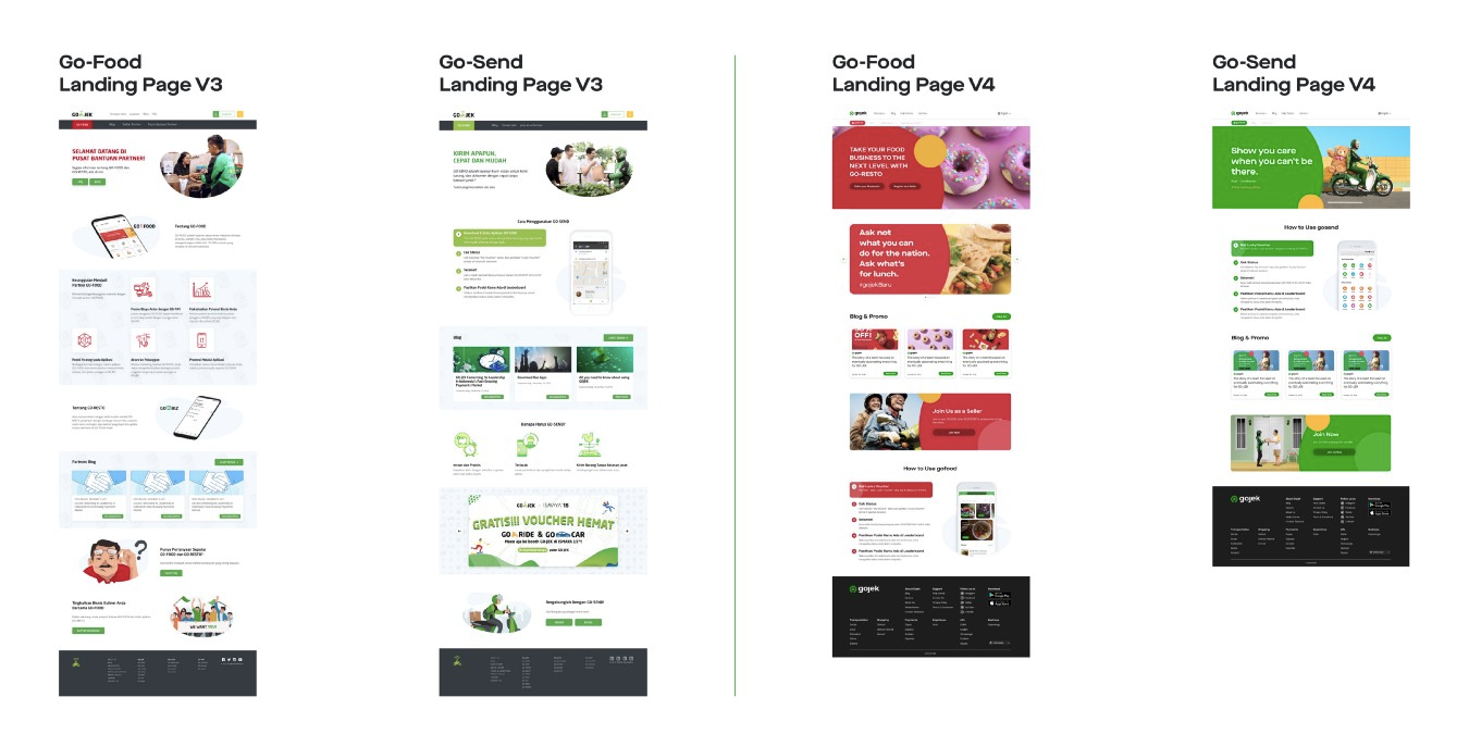
Gojek Web design varies from between versions. Every component has a similar shape, but has different colour variations. You can see the differences in the interfaces between version 2 and version 3 in the ‘Hero’, ‘Information’, ‘Join’ and ‘How To’ components here:
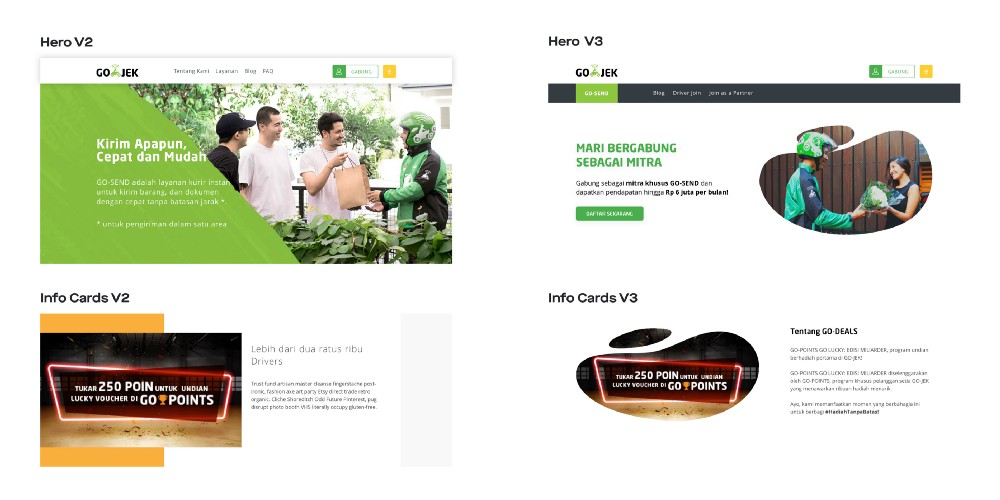
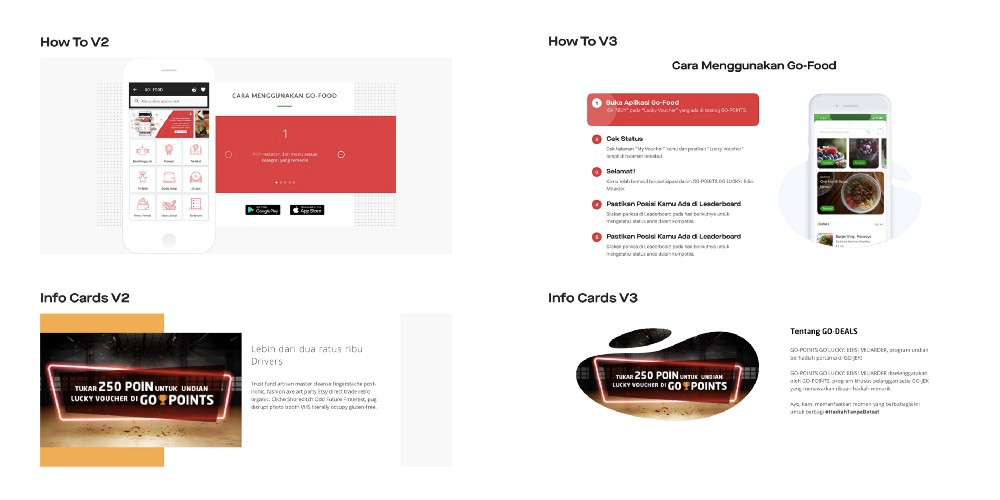
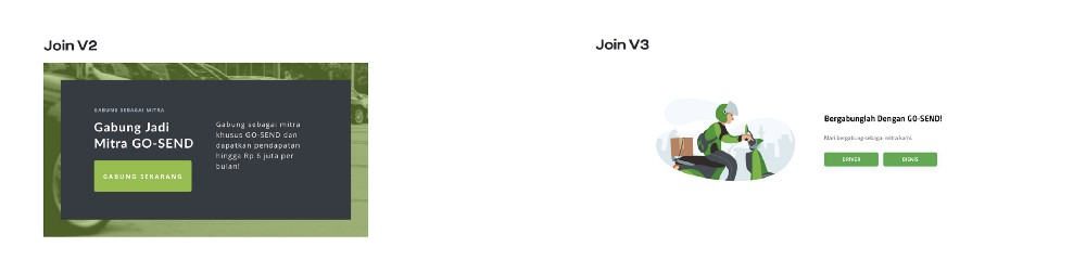
The only difference in each version is the colour (based on the business unit). However, as developers, we have to rewrite the code to incorporate these changes. Now you might ask, why don’t we use the same components over and over again? Let’s just say, the way version 3 was built did not give us the flexibility to use such components. This was something we wanted to fix in our new version
This was not the only problem, however: the interface testing process often produces different bugs even though the actions taken are the same. This is also due to inconsistent design.
The onus of solving these issues was on our team. For reference, this team is made of different components — Frontend, Backend, UI/UX, Quality Assurance and Content.
We wanted our latest iteration (version 4) to be cohesive and scalable.
Problem Solving Time
1. Scanning and Reorganising
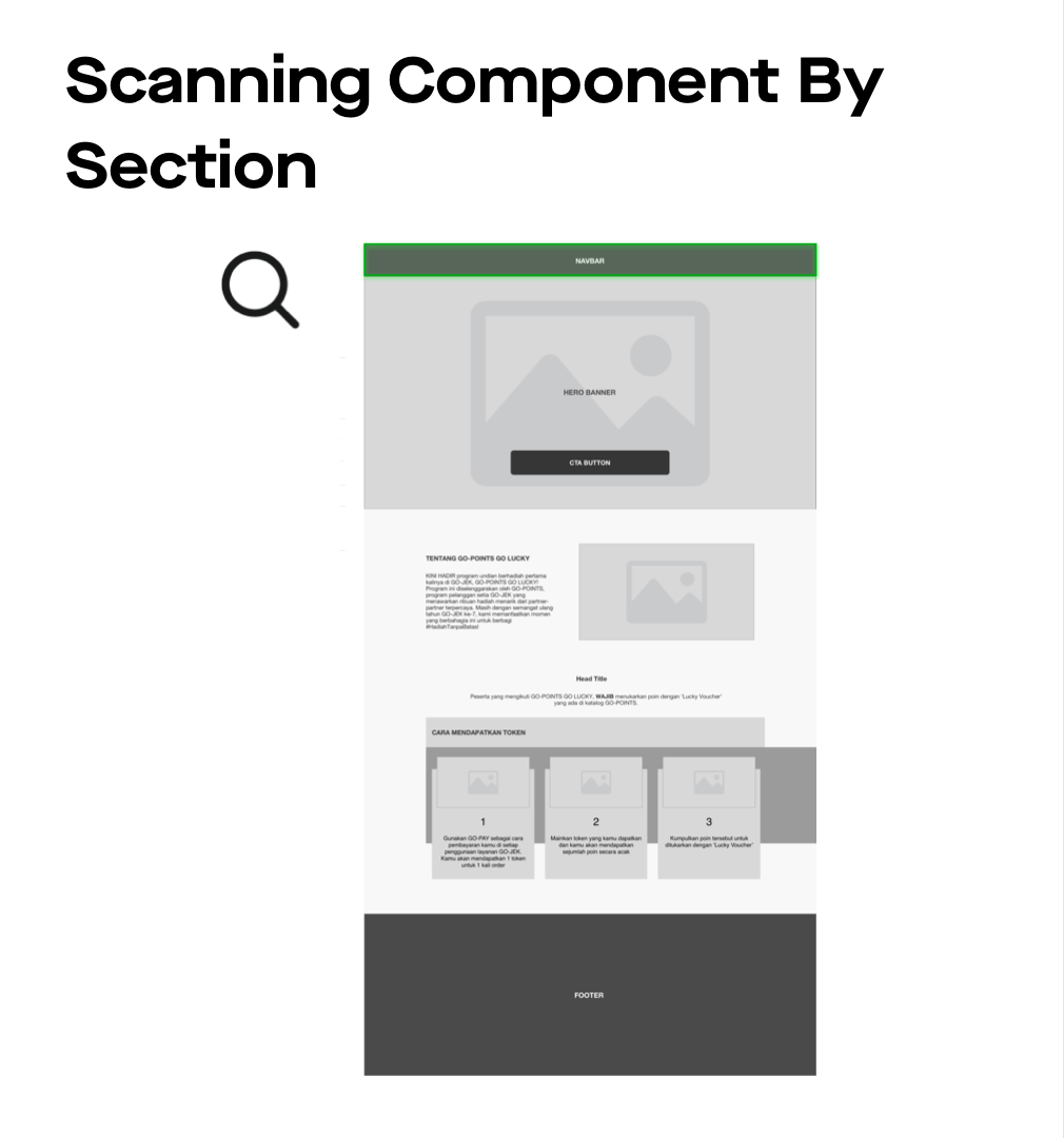
The first thing we did was to scan all components from the previous versions of Gojek Web, all the way up to version 3. At this phase, naming and categorisation are the main activities. The development team then coordinates with the UIX. Components that have various colours are recorded. For example, the background-color property depends on the Gojek service cluster, GoFood = Food & FMCG (red), GoPay = Payments (blue), GoSend = Transport & Logistics (green), etc.
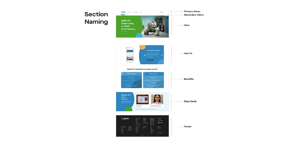
From the above example, the Hero Component comes with image, title, and description, the ‘How To’ Component comes with list image, title, description and button. the ‘Benefits’ Component consists of heading, subtitle and list item, the ‘Step Card’ comes with title, description, and steps (image and instruction). Each component section needs to be registered if there is a layout change. At this phase, we also discuss with the backend development team and redefine the fields that can be integrated.
2. Working in pairs
Each team coordinates to determine a rule in handling each task. We also often do a ‘knowledge sync’ from each division. Our approach is as follows:
- The UIX team creates design guidelines that can be used as a reference for making the components of each business unit in Gojek. These guidelines will be used by the QA team in testing. Every addition of a component is based on the styling of the previous version. The UIX team will deliver the results to the front-end developers in the collaboration tool we use, Zeplin.
- The front-end team then implements the design as a component section. At this phase, the front-end team isolates the developed UI process in a different repository. The results of the UI implementation will be tested in different branches in one UI repo, together with the QA team.
- Once each component has passed the testing phase with 100% passed, it can be integrated into the Content Management System, the main repo of Gojek.com.
3. Evaluation
At this phase, each team will share the results of the implementation. If there is a difference in implementation, it will be discussed for further improvement. This evaluation will typically be carried out several times.
What has changed?
This time around, we created a landing page builder that is integrated with the main repo. Usually, the current component that is created only focuses on the front-end, so the front-end developer will have to re-insert the code even though it is only re-imported. This concept can actually be integrated with the API (Application Programming Interface) of the CMS, so that control of the landing page can be from CMS made by the backend.
We reduced API Implementation in the component integration of the page to be created. For example, if the GoPay business unit wants to change the landing page with a new look with the available components — CMS users can directly select components and provide appropriate copywriting. The components of our page builder already support multilingual.
You can also see the component documentation on this page (aspal-gojek.netlify.com).
So there we have it! From a rigid interface that required a lot of work to update, we now have more streamlined landing pages that can be updated more easily. This was an interesting journey for us and I hope this post helped you learn something about how we solve our challenges. Meanwhile, give the site a spin! 💚
Image Credits: Dipa Praga (Web UX Designer)
Want our stories delivered straight to your inbox? Sign up for our newsletter!