How we built the new GO-JEK Rider App
.
By Anup Cowkur
This is a caterpillar:

This is a butterfly:

This is the old GO-JEK Rider App:
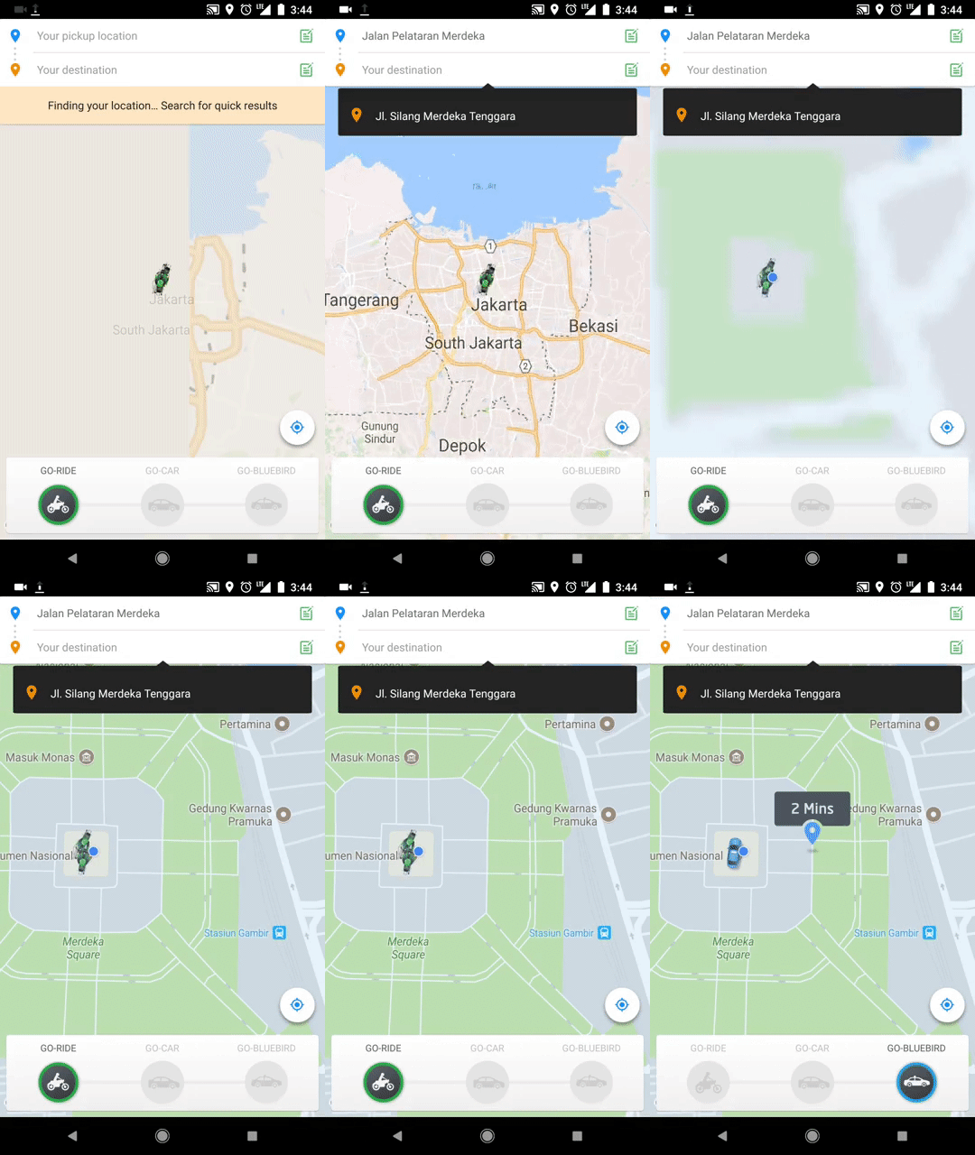
This is the new GO-JEK Rider App:
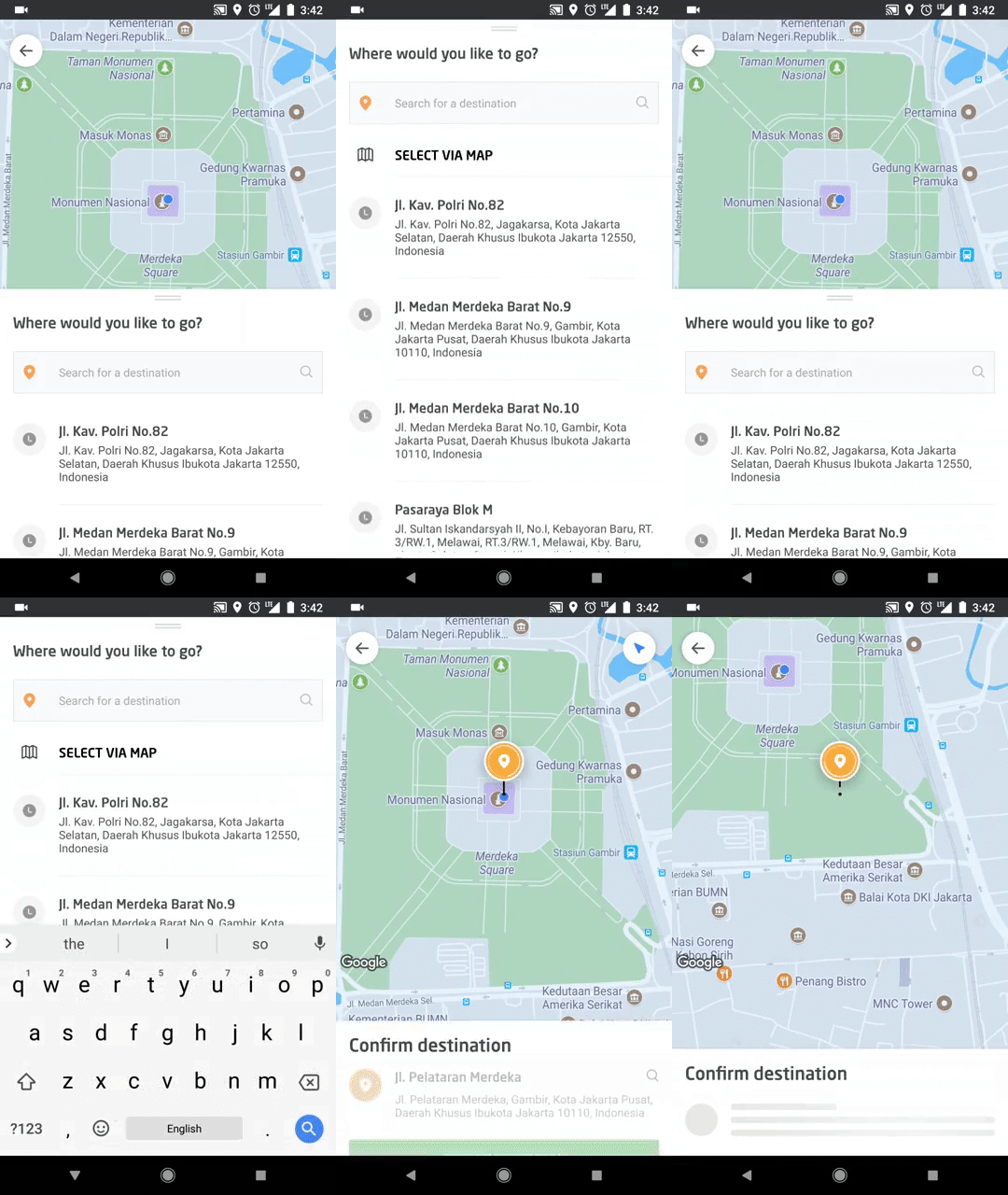
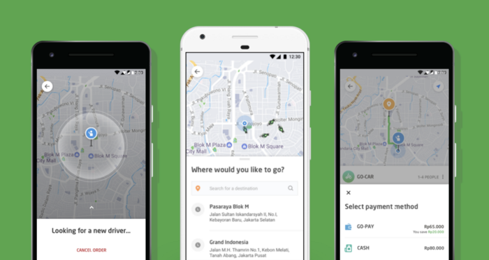
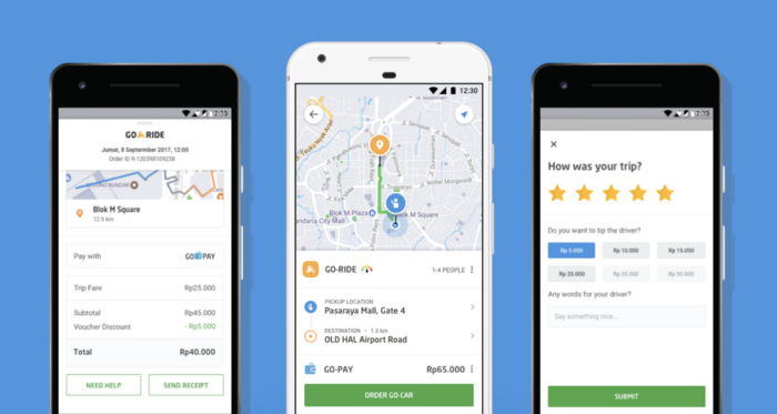
Here’s our story.
How to destroy everything
In the June of 2017, we decided to tear down the old Rider App and do it all over again.
But why?
Simple — It wasn’t the best version of GO-JEK we could put out there.
Our product is the most widely used transportation app in the fourth most populous country in the world; millions of Indonesians use it every single day. People use it to get to work, go home, pick their kids and visit their friends. The service is great. It’s an extremely useful product and people depend on it everyday.
But, the quality of the app simply did not match the quality of our product.
Our drivers care about our customers. Every engineer, designer, product manager, UX researcher and customer support specialist care about our customers.
Then why does the app not reflect this?
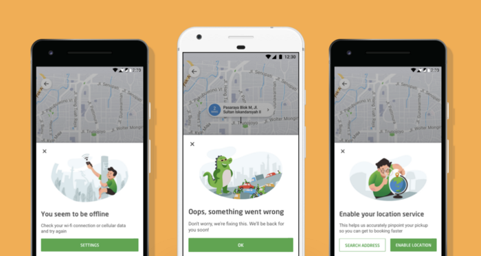
Legacy UX. Hacks to add new features built on top of older hacks to add older features. Error messages that don’t tell you anything except that something went wrong. Too much information in some places. Too little in others. A codebase that aged so much and was so unloved, engineers refused to touch it for fear of breaking things.
Our customers deserved better. Waaaay better.
So we started talking about it. As things like these do, It was initially met with resistance. Then resistance gave way to consideration. And consideration gave way to hope. It took a lot of discussion, reflection and internal debate. What’s the ROI of doing something like this? Is it worth stopping feature development for months together? Should we just build more features instead? How do we know this will even succeed?
Huge time and resource commitments, small chance of success and the opportunity of a lifetime.
Sounds like a plan.
How to build it, again
It’s the people, stupid
To build something beautiful, you need 3 things — people with talent, people with conviction and people who will climb over, crawl under or straight up tunnel through any wall that gets in the way of a mission.
I’ve had the privilege of working with exactly the kind of people who embody these qualities at GO-JEK.
We have designers who are quite simply magicians. I’ve seen hundreds of variations of illustrations just to convey a simple message like “Our servers are busy right now”, in a way that our customers know we are working hard on resolving the problem and that we aim to keep their faith in us.
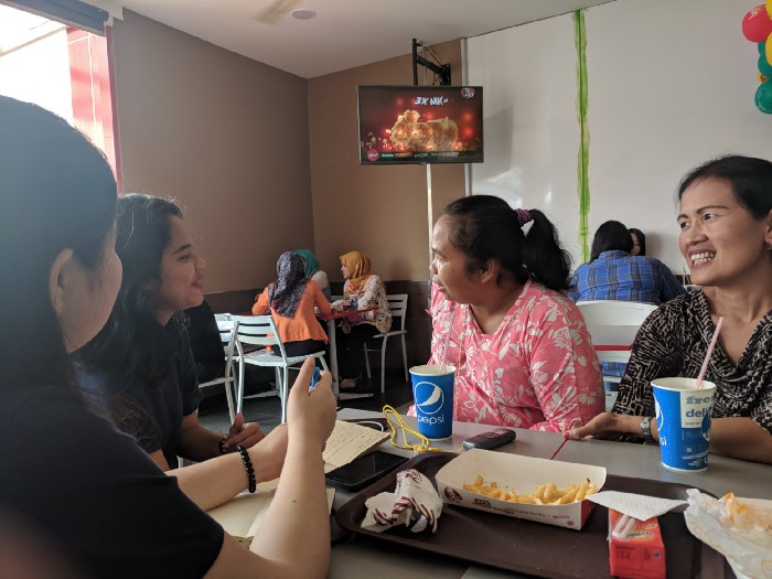
Our UX researchers travelled to small towns across Indonesia to collect feedback from users. These are our customers too and our team gets that. We wanted to hear from far and wide; the more we learn, the stronger we get.
We have developers who truly, deeply understand code is for the people. Code in itself is not the goal. Code is a means to achieve a great product. Good code is absolutely essential to build a great product, but good code in itself cannot a product build. That part is left to the humans. And our devs are humans first, engineers second.
We have product managers who know that the essence of product management is to guide the product in the right direction with data. It is not to micromanage people and move JIRA cards to track vanity metrics that make the practice of software development itself seem more important than the thing which it is supposed to produce. They know how to give feedback, they know how to receive it and they know when to get out the way and let the team of experts they’ve curated do their job.
Once you have the band, it’s time to make music.
The big rewrite/redesign
Joel Spolsky says you should never do a big rewrite.
We did a big rewrite.
From July to September, we completely rewrote our entire iOS and Android codebase for the Rider App, from scratch.
To start, we made specs. We painfully and tediously documented every behaviour and edge case in the old app we needed to keep. We also documented all the new behaviour and edge cases. The reason most rewrites fail is because they don’t do this work of carefully documenting the original and end up leaving out details and edge cases that the old, battle-tested code handled.
Once we had specs, we had four months of heads down development. We would make a version and our UX research team would get a group of people to test it. We tried to keep this iteration cycle as fast as we could. Each usability test gave us new insights to act on. We listened to what our users said, but behaviour often speaks louder than words. This line is hard to tread, but essential to learn how to walk it. We’re better now than when we started out and there’s never really a perfect answer. Intent matters though, and it’s usually hard to go wrong with a bunch of smart people who care.
We iterated and improved design processes, dev processes and code practices all the while iterating on the product itself. It was a hell of a ride and we finally had the app we were dreaming of in the hands of internal employees.
People at GO-JEK loved it. Most started using it as their daily driver and didn’t want to go back to the old app ever again.
But how do we know if it will actually, really work once it leaves the safe cocoon of our office?
The beta
The only way to see if something works is to see if it works.
We had two different core flows in the new app. Essentially, we had two new apps. We had to pick one. It was time to let the people decide.
In October, we put out a beta for 4,000 users. 2,000 had flow A and others had flow B. We used analytics to track our key metrics like conversion and booking time to see which one did better. Another awesome tool that helped us was Appsee. This tool lets you see videos of users interacting with the app and is a fantastic way to figure out UX problems.
After running the beta for a month or two, the numbers between the two flows were similar and did not give conclusive answers. So we bumped up the beta to 60,000 users in each flow and let it run for 2 more weeks.
The numbers remained similar for both flows, but we noticed that the UX in flow B allows a better GPS accuracy. This was because it delays the decision to point out where the user is a bit later (when it comes to GPS signals, a few seconds delay can mean an accuracy difference of 400–500 metres). Better GPS means better pickup selection, better location prediction and a better booking experience.
So it’s flow B then, right?
The choice
Flow B had the potential to turn out better in the long term. Its design afforded more screen real estate to add more features in the future and GPS accuracy was better, as mentioned earlier.
It had one area of concern though — its UX was more different from the current app than flow A.
The team was split on choosing between the two with passionate advocates on both sides. Some argued our customers would get confused if we make it radically different from the current app. Others said they’ll figure it out and we should trust our instincts. Since data hadn’t proven that either was objectively better, it came down to a judgement call.
My team was advocating for flow B (the more radical approach) and our CEO Nadiem thought flow A would be better. On one fine December evening, we argued it out. Not just discussed, but actually argued. We spent an hour fighting about it and finally, Nadiem told me “You’re asking me to take a leap of faith”. I simply said, “Yes, I am”. He took it.
Good leaders manage, but great ones trust. We like Nadiem.
The Battle
We started the new app rollout this January. Reviews are great and our customers are voicing how they love the new experience.
I’m falling in love sama tampilan baru @gojekindonesia di iPhone X.
— Asna Pohan (@iniAsna) January 29, 2018
Very, very refreshing! ❤️❤️❤️
Wah tampilan @gojekindonesia di iOS baru nih! pic.twitter.com/Rbx6WCzmDY
— Daniel Giovanni (@qronoz) January 29, 2018
wow! tampilan GO-JEK yang baru amazing! ❤️
— Primuadji Baskoro (@jimuadjie) January 29, 2018
The work isn’t done yet. Work is never done. We’ll keep improving the experience and iterating on new features, but we can’t help but feel proud of this feedback from actual customers 😊.
The War
Something ends, Something begins. The Rider App is just one piece of the whole universe of GO-JEK products. Work has already begun on our other products and we’re going to redesign and develop fresh new experiences for them in the coming months.
There’ll be more detailed blog posts about our work from our dev and design teams in the following weeks, so watch this space.
If you want to try out the new design, you can download our iOS and Android apps.
Oh and by the way, we’re hiring.
Ships and Oceans
I’ll leave you with a quote from Antoine de Saint-Exupéry:
If you want to build a ship, don’t drum up the men and women to gather wood, divide the work, and give orders. Instead, teach them to yearn for the vast and endless sea.
