How Design Can Build or Break a Business — 1 of 3
A UX case-study on redesigning the GO-FOOD ‘Checkout’ experience | (Part 1 of 3) Why we needed a redesign.
By Fatema Raja
GO-FOOD needs little by way of introduction. The largest food delivery service in Southeast Asia, 300,000+ merchants, 16 million menu items… you get the drift. With figures like that, you’d expect the GO-FOOD user experience to be the best in the business.
Why then, did nearly 20% of GO-FOOD users leave the checkout flow after adding items to their cart?
Something wasn’t adding up.
Our user flow was broken, and we needed to fix it.
TL;DR: This post is part one of a three-part series highlighting the case study and critical considerations that went into redesigning the Checkout experience for GO-FOOD — GOJEK’s food delivery product.
Lights, Camera… 💡🎥
GOJEK was going through a major facelift in 2018. For a Super App with 19+ products, we had all the scale-related issues one could imagine. We desperately needed an efficient system for our designers and developers. This gave birth to Asphalt — GOJEK’s very own Design Language System.
The redesign started with our transport app — GO-RIDE. It was then time to show some love to GOJEK’s prodigal child — GO-FOOD. The product owner walked up to to me and said — “Let’s go beyond just the UI, and rethink the entire user experience, instead of ceding over features as is.”
What he meant — “Get ready! Lots of sleepless nights coming your way. We’re going to do a mammoth redesign, the likes of which minions like you will crumble under.” 😅
🎬 Action!
We wanted our redesign to solve problems with specific business constraints, and we knew it was impossible to do so without delving into user problems first.
Finding the right problem to solve is harder (and more important) than finding the right solution.
First comes the framework
To achieve this, we pinned some critical thumb-rules before embarking on our redesign journey:
- To be data-driven. (“Design is not about making things pretty” — I’m going to parrot this line 10 times over in this blog and if you ever talk to me😅)
- To incorporate the existing brand perception into all designs. (Marketing says fun and creative but product looks dull and boring?Problem!)
- To empathise with users and business requirements. (Always chase the full story, be user-centric and business-driven)
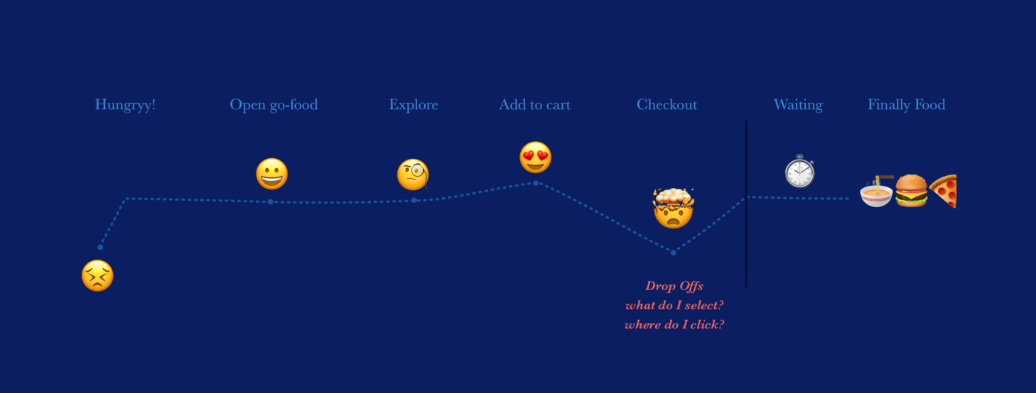
To put the framework to use, we started white-boarding our in-app user flow. In the journey graph, we noticed a large number of users were dropping-off at our checkout page. That means nearly 20% of our users who added items to their cart, left the flow right before placing the order (the last step) — the checkout page
Understand users’ pain points 😩
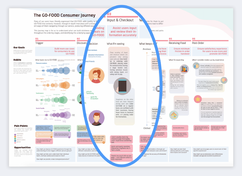
The second step was to understand our users’ pain points with the existing UX in the checkout flow. To dig deeper into this, we reached out to our users directly (kudos to the research team for setting this up). We adapted both qualitative and quantitative methods to get to the root of every problem in the picture. We then accumulated all our learnings into a consumer journey infographic.
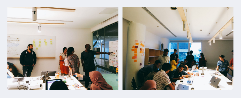
We wanted to involve the whole GO-FOOD team, beyond just research and design. This made it more collaborative than the traditional sharing and feedback loop. To reinforce this, we conducted several internal sharing and brainstorming sessions. The research team also put together a fun quiz for user personas.
What were the results?
As anticipated, our users felt agitated, confused and overwhelmed, resulting in a big drop off at the Checkout page. Here’s some of the feedback from our users:
“I find this step too confusing.”
“A lot of times my order button is disabled (grey) and I don’t know why.”
“I often miss rechecking some information at this step, most times I only focus on payment.”
This entire process was important for us — to be able to go to the field, do interviews, research, and speak to our customers directly. It gave us tremendous insight into the product development, and is precisely what made our product so good. This was not only fun but extremely useful.
With all the research and data at our disposal; we realised that redesigning the checkout flow first will not only enhance the user experience, but help solve a critical business problem.
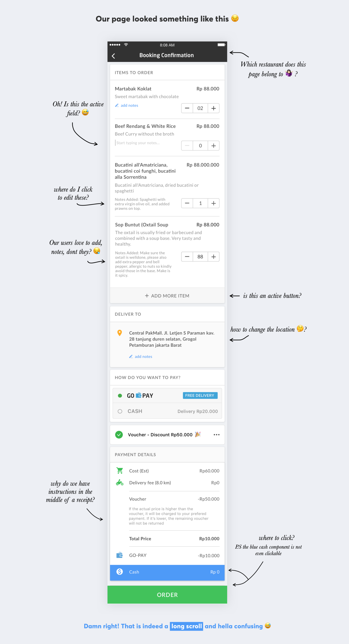
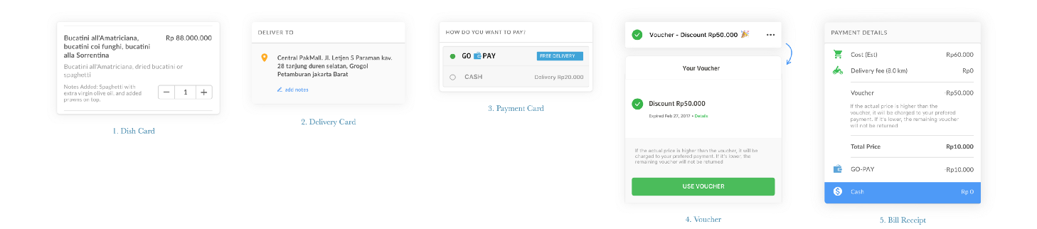
The original page consists of five components on one single page. It was extremely overwhelming for most of our users:
- Dish Details and Notes card
2. Delivery Location Selection card
3. Payment Method Selection card
4. Voucher card
5. Billing & Discounts card
Hats off to our users for being patient. I say this because every time a user lands on this page, they had to process a verbose set of information, and perform countless actions in a single page to just ‘confirm’ one food order. Painful. 🤬
Design is integral. Design is sacrosanct. While companies are now paying heed to the importance of design, GOJEK, by virtue of being a #SuperApp, had to imbibe design logic into its very fabric.
So we got to work.
Defining each problem ⚡️
Once we dissected the users’ goals and pain points, we had a clear picture of all the problems that plagued the Checkout flow. We narrowed our learnings to five primary user problems to form a common understanding of what we were trying to solve.
Problem 1: Verbose Information
The first thing most users did on this page was scroll, scroll and scroll. 3 scrolls minimum. Also, did you notice the amount of text? We’re in the age of micro-blogging and us millennials have the attention span of goldfishes, for crying out loud!
Problem 2: Cognitive overload
The page was overflowing with tasks that required explicit actions from the user. Do this. And that. And hey, this too. Oh wait, THAT TOO. Chaotic. Select delivery location but first find where it is, check the total, select payment method, glance through all the dishes added to the cart, apply your discount voucher….🤯
Problem 3: Prolonged Checkout
Too many actions and redundant information caused users to spend more than 2 minutes just to confirm and place a simple order. Time wasted, energy wasted, tummy still not fed. 😫
Problem 4: High Cancellations
A large sum of our users hurried through this step without actually double-checking delivery location details (buried under a scroll somewhere). This resulted in nearly 3% of our users cancelling and reordering the same cart with an updated address (that’s another story in itself).
Problem 5: Lacks Love
There was nothing delightful about this page. The dishes didn’t have images on checkout, the icons weren’t consistent, and had too much clutter. It was just text and buttons stacked in the form of black and white cards. No, seriously, even the active ‘Add more items’ button was a plain grey.
In a nutshell, our flow lacked information hierarchy, delight, structure, was too complex, and in all… poor.
In order to fix this, we spent a month researching, ideating, and defining the problem. Then we ideated some more, deliberated, chugged way too much beer (to add some philosophical thinking), and tried to justify one solution after another with the right data and metrics.
We were ready. We had all the answers. 🤦♀️
Boy, were we wrong.
In the next post, I’ll detail all the steps we took to arrive at this perfect (lol) solution — and how it all went downhill.
Working at GOJEK is an exercise in learning from experience. Sometimes, we find ourselves confronted with undocumented and unsolved problems — which are expected when building a Super App. We could use a hand in solving these problems though. If you have the skills for the job, head over to gojek.jobs, and join the crew of our rocket ship. 🚀