Gojek’s Rebrand Story: The New Logo
Every rebranding exercise has to start somewhere. Ours started with the logo.
By Fran Hakim
When we first got the brief that Gojek was going to undergo a rebrand, our first reaction was shock.
Then, we got interested.
It felt a lot like when you and the gang decided to take a road trip together to a hidden gem of a beach somewhere in Malta. You set an expectation, realise that the journey won’t be easy, but have a feeling it’s going to be worth it.
In this post, we talk about the start of this journey, which involved one of the most crucial part of Gojek’s brand identity. The logo.
The Challenge Before Us
Logo is one of the most visible part of company identity, and in Gojek’s case, replacing this familiar, iconic element would not be easy. The motorcycle rider logogram already had an emotional connect with our users and partners.
This change would reflect not just on the app icon on our core media, but on our headquarters, a landmark in Jakarta’s Blok M area. This would be followed by updating the attribute of our partners, not to forget branding in our offices in Singapore, Bangalore as well.
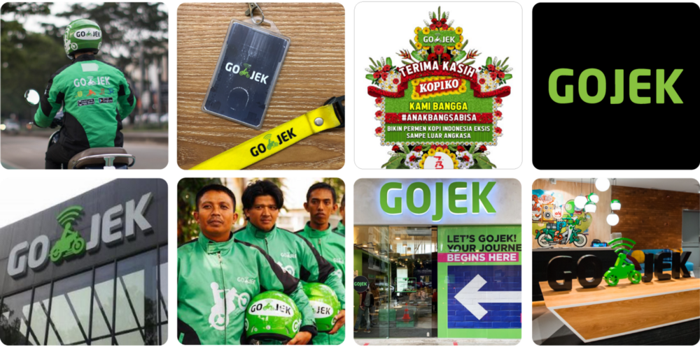
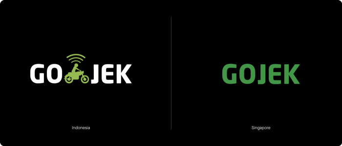
It was pretty challenging case, because the previous logo — though iconic — did not suit and fit the company service offerings today. The main reason for this included Gojek not being primarily a transport company anymore, and not operating two-wheelers at all in Singapore — one of our most important market.
So, we changed.
Design Process
After dealing with the challenges this icon had posed, we needed to do a lot of exploration to find the right element to replace it. So explore we did.
We teamed up with Creative Lab (one of Gojek’s internal creative teams) to go through all possibilities. We discussed, going from wow-this-is-so-graphic-design-design to a very minimalist-edgy-contemporary-nowadays-so-trendy-look.
There were a lot of trials:
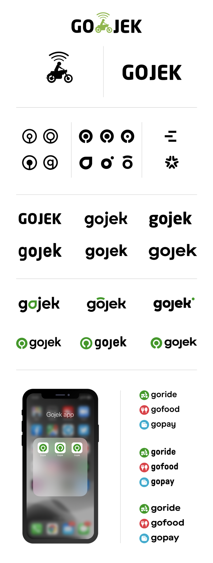
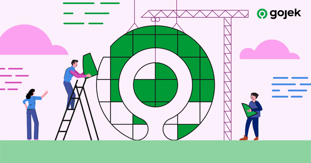
Eventually though, we nailed down a mark that suits our needs.
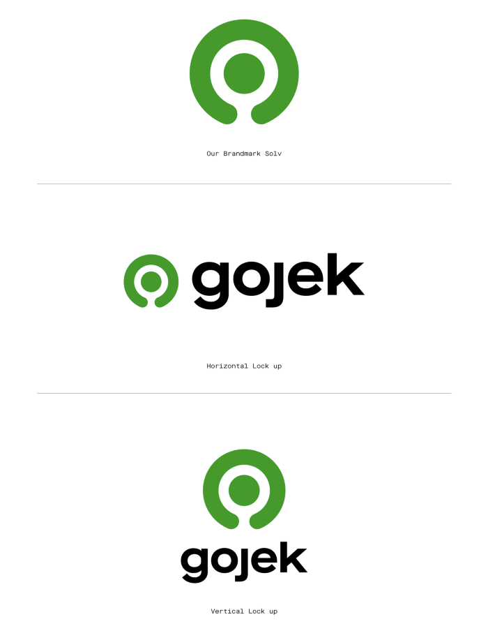
We found Solv.
Solv was created based on our discussion with every major stakeholder in the organisation. It was like picking everyone’s favourite song so we could do a kickass karaoke together that would cater to everyone’s needs and bring out the best harmonies.
Logo Story
Today, Gojek is many things to many people. It’s an answer to the world of problems one battles seven days a week — transaction hassles, midnight cravings, moving from one to another locations, household chores, falling footfalls, laundry woes, literally many things.
You can read more about the rationale behind the rebrand here:
 Fatema Raja
Designed to Scale
What is a good design without a guideline behind it to maintain consistency? We knew there could be no shortcuts, so we devised some golden rules, and some do’s and dont’s.
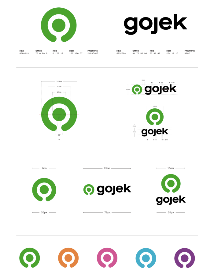
The logo comes with two elements that support each other — one to the eyes, one to the mind— which are, logogram and logotype. As we already mentioned — we called the logogram Solv. We decided Maison Neue Extended Bold would be our guardian for the logotype.
We use Maison Neue Extended Bold because we need a typography that suits all our needs, and is distinct while remaining recognisable. It is also useful to other BUs such as HR, Marketing, UI/UX, and developers.
Usage of the Logo
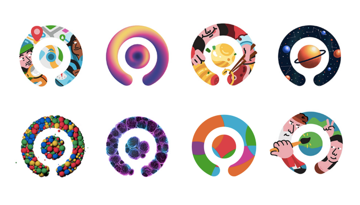
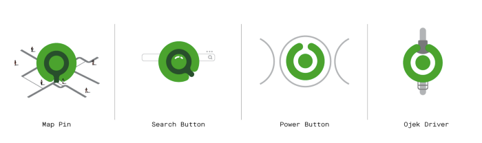
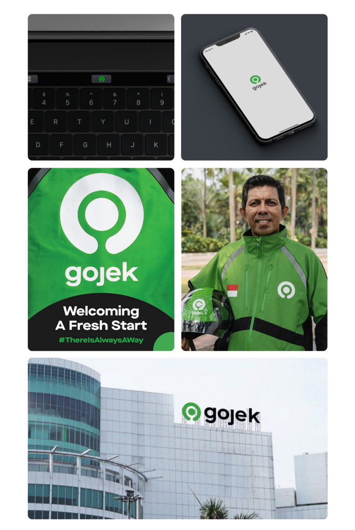
We weren’t done yet, as there was another concern we needed to Solv. 😉 We believed a good logo must work well in every situation, from a letterhead or a browser tab favicon, to partner jackets/helmets and even billboards. It should be an instantly recognisable familiar element, even if one were to come across it in another country.
After many discussions, arguments, and constructive feedback sessions, Solv became the pin point where everyone could come together and jam to the rhythm of our soundtrack.
Our metaphorical roadtrip had taken us on a long and winding road, but as we had hoped, it had all been worth it. Now, onwards to new horizons!
A big thank you to everyone who took part in the process of creating a new logo, and gave constructive feedback that helped us! Even those cool folks who made funny representations using the logo. 🤗
