Gojek Chat: The Gateway To Successful Order Completion
The ups and downs we faced while iteratively designing driver-customer chat.

By Nikhil Yadav
Back in 2015, when we launched the Gojek app, we had three services to offer. It was a simple app aimed at making our customers easily get through their day. Slowly, our ambitions grew, so did the number of products we offered.
There was nothing simple about the app anymore. A Super App had arrived.
Today, millions of users transact on the Gojek app every single day. With such a massive scale, every team at Gojek shares a huge responsibility.
Imagine being already late for work and wasting precious minutes looking for the ‘Book Ride’ button because we just decided to move it elsewhere, and didn’t even bother to tell you about it! The ramifications of any seemingly small design or product decisions have an amplified impact.
Here’s the story of a design project that was expected to improve a feature in driver-customer chat… But resulted in the opposite. 🤦♂️
This was my first big project with Gojek. I was so full of hopes and dreams, but this feeling didn’t last long though. Within a few days of launch, user complaints skyrocketed, and app store ratings plummeted. Surprised and dejected, my team and I buckled ourselves together to fix the mistakes.
Easing the coordination with driver partners
The Gojek ecosystem completes over 200 million orders a month, and our driver partners fulfil a large part of these orders (like GoFood, GoCar, GoSend, GoRide, etc.). Customers and drivers partners rely on a better way to communicate instead of traditional calls, so there’s reduced friction during coordination during an order. Here’s where our Driver to Customer Chat comes in handy.
Customers use Gojek chat for 90% of their orders to coordinate with our drivers partners. 💬
The coordination between customers and driver partners is usually full of hassle, especially when drivers have difficulty finding our location or we’re stuck in crowded places. Hence, it becomes imperative for us to try and improve this experience and reduce inconvenience as much as possible.
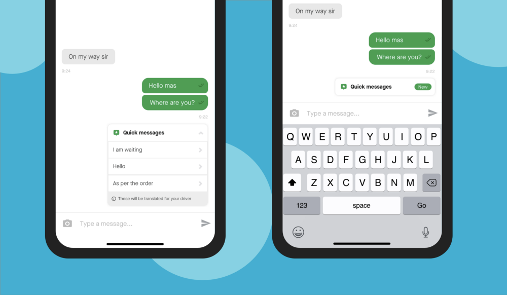
Quick Messages — The first solution
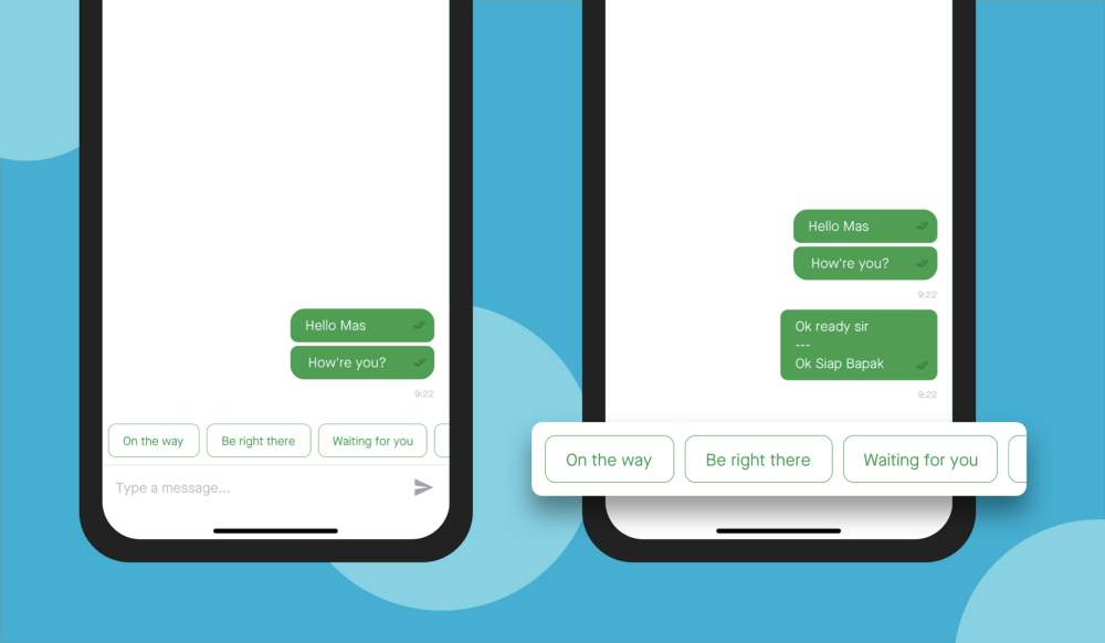
Quick Messages feature was launched as the first step to easing Driver-Customer chat. We analysed and surfaced the most typed messages between customers and driver partners on the chat window according to relevant booking status. This helped customers to send the messages with one tap and reduce the effort of typing messages on the keyboard.
After the launch, our numbers revealed that not many were using the feature. To understand why this was happening, we collaborated with our research team and did a user study to understand this behaviour further.
We found out that users were facing difficulty while scrolling the horizontal list to find the right message.
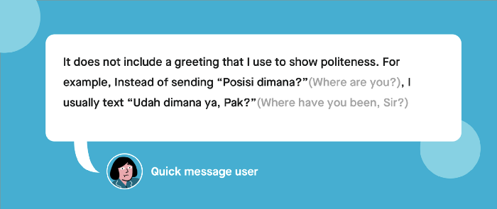
Besides, some users also pointed out that the messages weren’t colloquial and quite formal, which made them hesitant to use the feature. They wanted to show politeness and gratitude to their driver partners by sending more personalised messages.
Back to the drawing board
Armed with new insights and innocent enthusiasm, we restarted our journey. Apart from ensuring contextual and cultural relevance to these messages, it was important to first focus on improving the discoverability of the messages itself.
As a result, we proposed shifting the messages from a horizontal list to a vertical one. This would not only help us in legibility and better interaction but would also allow us to fit longer and more personalised messages in the future. We also decided to keep the layout always open below the keyboard to allow users to quickly discover messages and send them to driver partners with ease.
While devs were busy analysing the feature, we created a static prototype to test the new design before launching it to customers quickly. With the help of our research team, we selected a mix of low and high quick message users and showed them the prototype to figure out any usability concerns while using the new designs. Some users showed apprehension towards the content, but there were no complaints about the changed layout, which gave us the confidence to roll out with the latest designs.
Pretty excited about the testing result, we launched the feature to internal users and waited for the feedback.
Embracing the storm
It was first our internal testing channel that started buzzing in with feedback from our alpha users. We weren’t anticipating the feedback because all our focus was to fix and improve the previous UX. We overlooked the major feedback around the abrupt jump in the Quick Messages card when messages load.
The added anxiety of the users while opening the chat window to interact with drivers was leading them to tap on quick messages when they intended to tap on the keyboard. This led to accidental messages being sent REPEATEDLY. Misunderstood as a bad internet connection problem, we decided to fix the same in the next release cycle and went ahead with a 100% production release.
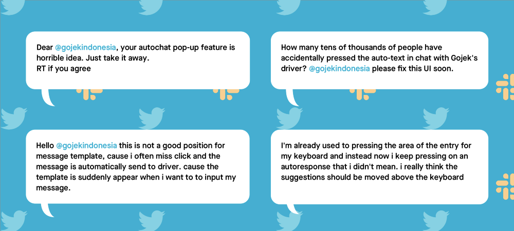
In-office, we were constantly discussing with our internal users and developers to understand the root cause of the problem, oblivion of the fact that some users had already started rating us with a one ⭐️ on Play Store. Some of them ended up complaining about this buggy new release on Twitter. The outrage was severe. The cracks of faulty implementation were showing up. 😨
Alarms started buzzing about the disastrous feedback we were receiving on Play Store. We had to do something and it had to be quick.
I remember my product manager and I jumping on a phone call at night and deciding to turn off the feature completely. To add to the mess, we hadn’t put the feature behind the toggle in iOS. 😐
We had to remove all Quick Messages from the backend. We were dejected. That day we realised that we had failed terribly in improving the feature and made it worse. It was such an eye-opener for all of us.
Back to the drawing board… again!
After turning off the feature, we needed to identify the issue properly and fix it so that we could turn on the feature again. We found out that the quick message API was taking some time before loading all the messages on the chat window. On top of it, on android, handling keyboard layout interactions was not straightforward due to which there was a sudden jump in the layout whenever a user entered the chat window.
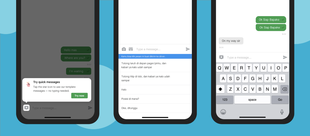
Because of the above reasons, we decided to hide the quick messages under a tap instead of opening it every time, and users could access it whenever they wanted. With this quick fix, we turned this feature on, again in the next release. Despite solving discoverability issues by adding a coach mark for users visiting the chat window for the first time, we saw no improvement in adoption. Users were putting more effort into typing messages than ever before.
We then decided to go back to our drawing boards to start from scratch and question the very existence of the feature:
Why do we need it?
What problem is it solving?
What are the alternate ways of solving it better?
How can we make it relevant?
How can we do testing better?
We also dug deeper into our past research to arrive at multiple iterations for the feature. We explored multiple possibilities — putting quick messages on top of the chat input in the form of a drawer, fixing them above input, adding a floating button.
No solution felt like the messages were a part of the conversation.
But then, we asked ourselves an important question:
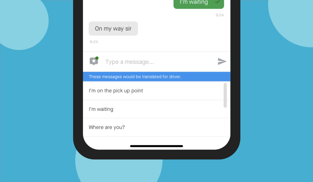
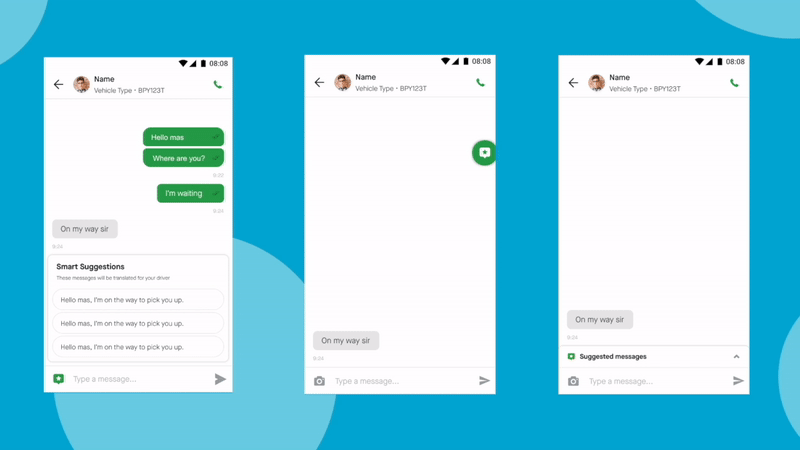
If Quick Messages are supposed to reduce friction for chat and help faster communication, why can’t it be part of the chat itself?
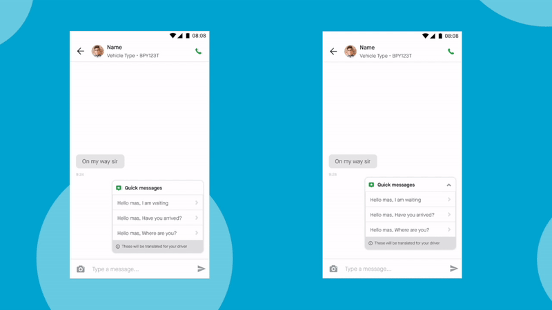
We sketched out an idea where we showed suggestions as part of the chat messages. We iterated on the interactions a bit and showed this idea around. Everyone loved the new idea.
The final design experiment
To avoid any confirmation biases, we did an A/B test with different versions (expanded and collapsed) of the last option and measured and compared their usage with our existing design. We put extra efforts into polishing each interaction to ensure that no previous issue happens again. Afraid of any unintended bugs, we launched it first for our internal users and waited for a week.
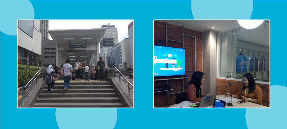
We used this time to test the developed solution with some users further. This time, we decided to test the full journey between the time booking is made to the time driver partner arrives at the location, instead of just showing users a chat window and asking them about the feature. This helped us remove any bias from the study and also enabled us to focus on the full experience rather than being limited to a screen. We also ensured that we test the feature in the natural environment, i.e., near the malls or office lobbies where coordination is generally difficult for the users.
The results of user testing were favourable. Having suggestions as part of conversations made the feature accessible and facilitated the usage of quick messages before thinking of typing. Our users loved the collapsible version of Quick Messages as it gave them more control over the space of the chat window. This was a small win for us but having failed before, we didn’t want to celebrate the success so early.
The big win
We started with 10% of users in production, split equally for both versions, and then waited for 2 weeks for the result. We were constantly checking social media and Slack channels for any feedback. Our eyes were glued to the screens as the graph was rising steadily and by the end of the 2 weeks, we saw a 3.5x improvement in the adoption. 🥳
We also saw users using the keyboard lesser while using the chat, which meant an 8% reduction in the typing effort. The positive feedback had us smiling ear to ear. We then gradually rolled out the feature to 100% users.
Our users loved the solution. We also saw our Play Store ratings returned to the old numbers.
Our learnings
The bittersweet journey of Quick Messages right from horizontal pills to vertical layout and then finally, the suggestion box taught us multiple lessons. It again proved the importance of listening to our users constantly, putting efforts in polishing small details and improving the feature can have a lasting effect on not just our adoption numbers but the brand of the company as well.
Here are the lessons we learnt from this journey and hope they can help you or your team to take such decisions in the future:
- Prepare for the unexpected
This being my first BIG project, I had never anticipated such failure with the proposed design improvement. Putting the feature/change behind the toggle helps in turning off a feature in an uncertain time, and it becomes easy to recover. - Respond quickly
Such an unanticipated outcome showed Gojek’s resilience. It was a fanboy moment for me. My team was not afraid to accept the failures, and instead of wasting time blaming any function or team, we all focussed our efforts on fixing the problem first. Wasting any more time could have resulted in more churn. - Start small and then scale
The other mistake we did during the release of the v2 experiment was to release the feature completely to 100% users. We realised the importance of releasing the feature to a small percentage of users, proactively seeking feedback from all possible channels, rather than just sticking to numbers (blind sighted with initial spikes in adoption) and then gradually scaling to other users. - Test for scenarios, not screens
During our first user testing, we didn’t take into account the environment or state in which the user will be using the feature. On top of it, we also used a static prototype for testing. Because of this, we were not able to catch any interaction issues. Chat is a dynamic product and hence should be tested in an interactive prototype. We should also try to aim for testing of the task/journey instead of focusing on the feature that is just a small part of the journey. This will help uncover some hidden insights that can further help improve the feature. - Polishing small details matter
We neglected the keyboard interaction considering it to be a minor issue, but it turned out to be the opposite. Hence in the latest design upgrade, I spent extra time with developers in polishing all the micro-interactions. Kudos to our developers for bearing with me throughout these small changes.
I’d like to thank all the Chat Team members who were involved in building and shipping this feature. Without them, we wouldn’t have been able to achieve such a positive result.
We are now putting efforts into making these suggestions more relevant by suggesting the right set of replies for the users depending on the messages they receive. There are many more feature improvements in the upcoming days.
Stay tuned!

Click here for more stories on how we build our Gojek #SuperApp. 💚