Decoding Event Branding — Ideation to Implementation
A designer’s perspective on what went into creating the visual identity of Gojek’s flagship hackathon for women coders.
By Brunda Olety
We recently conducted our flagship hackathon exclusively for women coders, dubbed SheHack. Incidentally, this was also the first major event we did after Gojek’s rebranding exercise. We had received a lot of registrations, and many people would be visiting our Bangalore office to attend the event. It was important to ensure all event collaterals (and the office itself) reflected our new identity.
From a design perspective, this was our objective. In this post, I’ll take you through how we achieved it.
Step 1: Craft the Event’s Identity
Before starting to design any event there are three things to be considered:
The Attendees 👩💻
An effective event design is attendee-focused. In this case, our attendees were students, fresh graduates, and junior engineers (all women aged between 21–35) passionate about tech and solving tech problems.
The Purpose 🎯
The major objective of this hackathon was to attract young women in tech to participate in the event and solve cool problems, while also promoting Gojek’s equal opportunity workplace and culture. To reflect this, the design had to be women-centric, fun, colourful and quirky to attract as many eyes as possible.
The Budget 😅
You can envision making an event as fancy as you like, but realistic implementation always boils down to budget.💰 With the budget set, we decided to go ahead with cool decor, a goodie bag for every participant and something sweet that they could relish at the event (which I will tell you about in just a bit 🙂).
Let’s get into details. The event preparation started a month before the big day. First, we needed a logo that reflected Gojek’s new brand style — which would go on all the collaterals and the event landing page.
This was the first version of the logo:
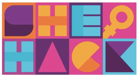
It’s so easy to go crazy with the colours, isn’t it? Especially when you have a lot of colours to play with in your brand’s palette! My initial idea was to keep it fun and colourful.
However, this idea did not fly. There were too many colours and it wasn’t easily readable.
Back to the drawing board, then.
We needed something sustainable, that we could use for a few years but still offered room for experimentation. I had to re-ideate, reduce the number of colours, and try again.. After a lot of iterations, we finally arrived at a logo that was clear, readable, and had a touch of fun to it!


With the logo done, It was time to announce the event and call for registrations. We had partnered with Skillenza to execute the event, and needed a landing page to display event details and invite applications. The next order of business was to design the assets that went on the landing page.

Step 2: Generate Some Buzz
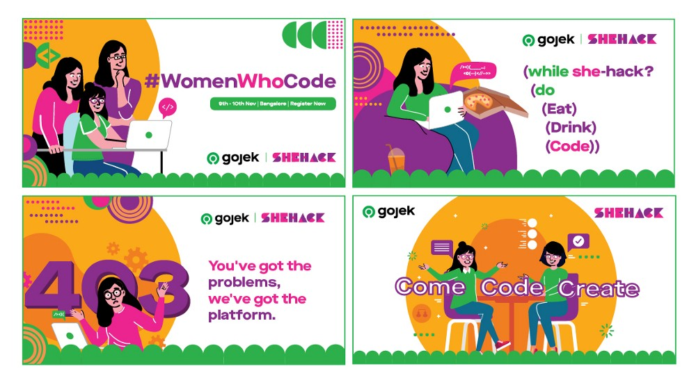
With the logo and landing page up and running, it was time to spread the word far and wide. This is where social media creatives came into the picture. Creatives with the right messaging and design are a key to attract eyeballs and make them relatable and memorable. Our word master Sooraj did a good job with it! And we came up with some colourful creatives that people wouldn’t miss.
We must have done something right, because we got an overwhelming response — 1500+ registrations. While our jury panel was busy shortlisting the ideas that came in, we had to start our preps for the big day.
We needed to make sure that the participants enjoyed the ‘SheHack’ experience. 👌
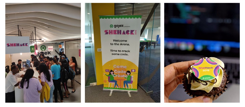
With 100+ participants expected, the Gojek Bangalore office — which was the venue for the event — had to be decked up to welcome our participants. We designed some way finders, danglers, standees, event Do’s and Dont’s, and even planned activities like zumba, yoga, midnight games etc.
Step 3: Excite, Execute
D-Day was here. It was time to open the doors and welcome the participants. How better to get them pumped than with a goodie bag with things needed for the hackathon (and some swag).
Have a look at the stuff we gave out! 👇
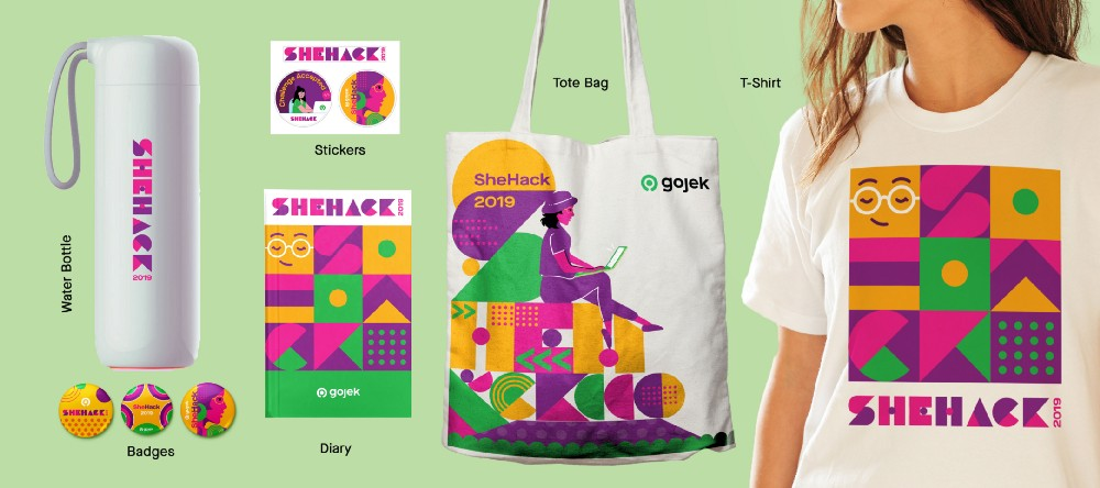
That’s not to say arriving at this point was all smooth sailing. Execution, particularly on the printing front, was challenging. As we were printing on multiple materials, we had to make sure that the colours looked accurate on all of them. At Gojek, we ensure we don’t do things halfway, so we did multiple sample prints till we got it all just right. Phew!
But it was all worth it in the end.
Our goodies were well received and much appreciated by all the participants. Some even changed into the T-Shirt as soon as the hackathon started! They used the dairy for brainstorming, and the stickers went straight on their laptop. It’s a great feeling to see your handiwork being displayed by the people you designed for. 🙂
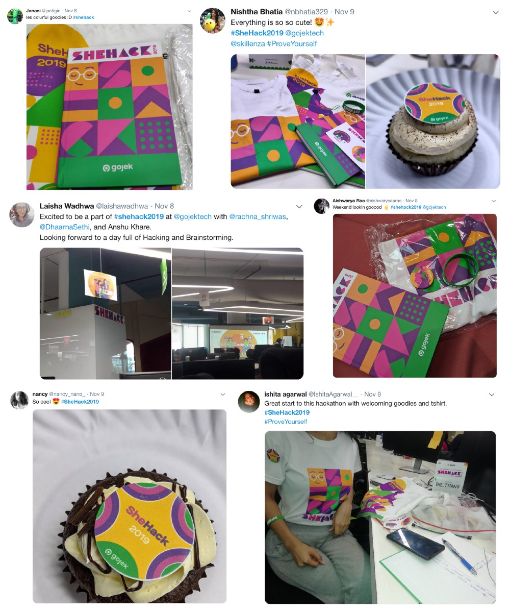
This was one of the biggest initiatives we undertook in 2019 — from an organisational and design front— and the overwhelming response just reinforced our faith that we did things right. 🖖
There’s a lot more coming from all of us at Gojek, and a many more stories to tell. Keep watching this space for more, or sign up for our newsletter and we’ll deliver a weekly update, straight to your inbox.
