Building Unconventional UI Shapes Using EdgeTreatment
How we used Edge Treatment to build components with non-traditional shapes in GoClub.
By Girish Suragani
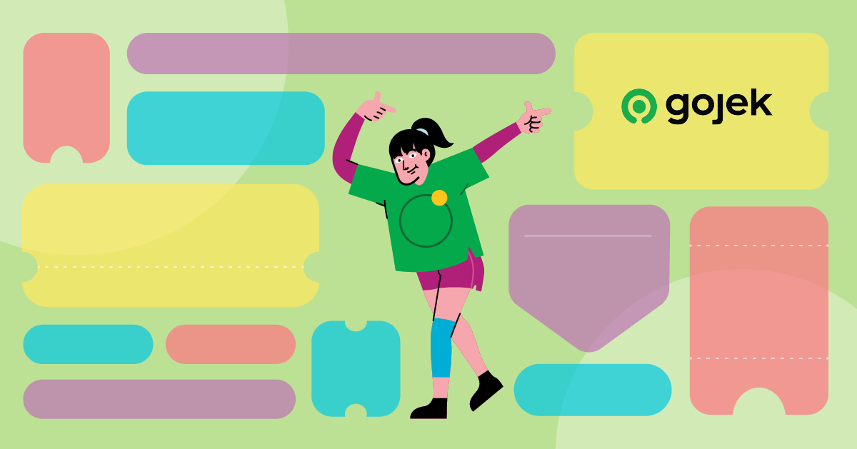
GoClub is a loyalty program by Gojek which rewards customers for using our 18+ products. It’s a striking balance between customer needs and attractive offers. XP (Experience Points) are rewarded to customers for placing orders on the Gojek App. Based on the XP, customers move up from one tier to another and stand a chance to gain surprise benefits. To read more about GoClub, click here:

Providing a great user experience starts from ensuring the user flow stands out. Our designers were tasked with creating the great designs and we as engineers set ourselves to implement these designs. In this blog, I shall pen down how we used Material Components to develop some UI components like GoClub Treasure Card, GoClub Claim Treasure Card, and Treasure Pill, in GoClub.


Material Components is a library developed by the Google Material team, which provides components to easily implement Material Design. A powerful but less commonly used component to develop non-traditional shapes is Material Shape Drawable.
Material Shape Drawable
This is a base drawable class for Material Shapes which handles shadows, elevation, scale or colour for a generated path.
Material Shape Drawable is used to implement Material Shapes in the apps, i.e. modifying properties of a view like shape, shadow, stroke etc. Material components like Bottom App Bar, Material Date Picker, Bottom Sheet, Text Field, Floating Action Button use it modify their shapes, colour, stroke, and shadows.
Material Shape Drawable takes ShapeAppearanceModel as a parameter which contains all the information on how to model the shape. To modify the shape of our view, we set the background of our view to shapeDrawable.
ShapeAppearanceModel
This class models the edges and corners of a shape, which are used by MaterialShapeDrawable, to generate and render the shape for a view's background.
Using this class, we can define the edges and corners of the view. It uses CornerTreatment to modify the 4 corners of a view. EdgeTreatment is used to modify the 4 edges (top, left, bottom, right) of a view. Depending on our requirement, we can define same/different treatments on each of the edges and corners. If we are able to use the ShapeAppearanceModel class properly, we can achieve any complex shape as it gives us full control of the edges and corners of a view.
Here how we can implement the below component using Shape Appearance Model and Material Shape Drawable:

- First, we create a ShapeAppearanceModel object, in which we use a pre-defined Edge Treatment (TriangleEdgeTreatment) for treating the left and right edges using setLeftEdge()/setRightEdge(). We use setAllCornerSizes(dpToPixel(12)) to define that the 4 corners of the view have a radius of 12 dp.
- Then, we create a MaterialShapeDrawable object by passing the shapeAppearanceModel to it. We also define that the shapeDrawable should have a tint colour of grey and a stroke with 2 dp width and black colour.
- Then we set this shapeDrawable as a background to our TextView to achieve the given design.
As you can observe, the component is built using just 10 lines of code.
At this point, you might be trying to figure out what is this TriangleEdgeTreatment - where all the magic happens. To understand that, let’s discuss about Edge Treatment in detail.
EdgeTreatment
Edge treatment plays a key role in defining the behaviour of how the edges are rendered and thus helps in building complex shapes. It has a method getEdgePath which provides us with length of the edge, centre point of the edge and a shapePath object. The ShapePath class provides us with methods like addArc(), lineTo() to the draw the desired path consisting of lines, arcs, etc. We can use the length and centre values to calculate the coordinates of our path and also the position of the shape in the edge.
Material provides us with some pre-defined Edge Treatments like TriangleEdgeTreatment, BottomAppBarTopEdgeTreatment, MarkerEdgeTreatment, etc. We can use these edge treatments directly if they fit our use-case. If the desired shape cannot be drawn using these pre-defined ones, then we need to implement our own custom Edge Treatment by extending it and overriding the getEdgePath(). In the getEdgePath(), we can use the shapePath to draw the required shape.
Pre-defined edge treatments
Triangle Edge Treatment
As the name implies, this edge treatment is used to draw a triangle in any of the edges. It’s constructor takes two parameters - size & inside. Size defines the length of side of the triangle. Inside is a boolean, if it’s true then the triangle will be inward facing otherwise it will be outward facing. TriangleEdgeTreatment is mostly used to draw tooltips or any view containing a triangle shape. The implementation of this edge treatment can be found here and is quite simple to understand.
Bottom AppBar Top Edge Treatment
BottomAppBarTopEdgeTreatment is a subclass of the Edge Treatment which is used to cradle a Floating Action Button (FAB) in the Bottom App Bar. Here, the top edge of the Bottom App Bar is treated to draw a semi-circular arc at the centre and the FAB is cradled in that arc. The implementation of the BottomAppBarTopEdgeTreatment can be found here.
Edge Treatment in GoClub
Let’s see how we have used the Bottom AppBar Top EdgeTreatment and Triangle Edge Treatment in GoClub to develop UI components having shapes like semi-circular arcs, triangles in the edges.
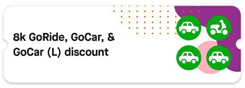
GoClub Treasure Card
This card contains the details of the surprise treasure claimed by the user. It is designed like a voucher with notches(semi-circular arcs) on the left and right edges. Achieving these notches along with card background image, shadow and card corner radius is not a straightforward approach!
Let’s draw a comparison between how this component is built by overriding the onDraw method and then see how easy it is to build the same component with Edge Treatment.
Method 1 - Overriding onDraw()
In this approach, we override the onDraw() method and draw the card outline using the canvas, path, rect and paint objects. Methods like arcTo(), lineTo(), moveTo(), etc of the path object are used to draw an outline of the card consisting of the notches and rounded corners.
Challenges noticed in this method -
- 6 arcs (4 corners + 2 notches) and 4 lines (edges) have to be drawn in the method. Calculating the left, right, top, bottom, offset positions for drawing every arc/line involves a lot of calculations and is prone to bugs.
- Adding a background image to this custom view causes some issues like the image doesn’t clip to the view path perfectly even after using canvas.clipPath().
- Adding shadow around the view is not straightforward. It can be achieved by drawing a black bitmap behind the card and blurring it, which is a resource intensive task. So, the onDraw is also called multiple times for drawing this bitmap and then clipping its path.
The component could be achieved as per design but we noticed slight distortions near the card notches and the corners. It is due to the onDraw being called multiple times. Also, as onDraw is called multiple times, it’s not an efficient approach and also prone to bugs due to the complexity and calculations involved.
Method 2 - Using Bottom AppBar Top Edge Treatment
We observed that the notches on the left/right edge of this card is similar to the semicircular arc (cradle) of the Bottom AppBar. So, we got the idea that we can reuse the Bottom AppBar Top Edge Treatment for treating the left and right edges of the card.
We have used the MaterialCardView instead of the CardView as it’s a material component and thus has support for directly setting ShapeAppearanceModel on it without the need of MaterialShapeDrawable. In the code, we simply use the pre-defined BottomAppBarTopEdgeTreatment and apply it to the left and right edges of our card and image. The fabDiameter refers to the diameter of the semi-circular arc. Then, we set the elevation on the card to get the required shadow. That’s how simple it is to achieve the component!
GoClub Claim Treasure Card

This card is used to claim the surprise treasures in the GoClub Claim Treasures screen. This card is much more complex compared to the previous one and has more functionalities. It has notches at the bottom instead of the centre and has functionalities like card selection, card expansion to show details.

In this card, we cannot use the Bottom AppBar Top EdgeTreatment to draw the notches as the notches shouldn’t move while the card is expanding/collapsing. Using the Bottom AppBar Top EdgeTreatment, the notches move as the notch positions are always calculated w.r.t to the centre of the edge. So, as the card expands the centre changes and thus the notch position.
Hence, we decided to implement our own custom EdgeTreatment class to remove dependency on the centre.
As the path of a card is drawn in a clockwise manner, the right edge is drawn from top to bottom and the left edge is drawn from bottom to top. So, in our custom class we pass the distance from the top to the notch as the offset and draw an arc using ShapePath at that offset value for the right edge. The left edge is a bit tricky as it’s drawn from bottom to top so the distance from bottom to notch position is passed as the offset. But the bottom of the card also changes as the card expands. To solve this, we add the offset from the bottom with the increased length (as the card is expanding) so that the cradle appears to stay in the same position.
Treasure Pill Component (Tooltip)
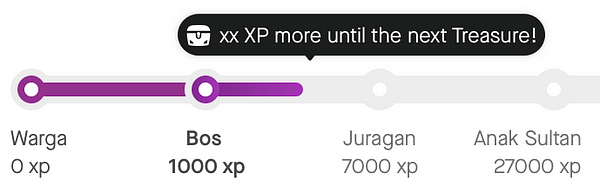
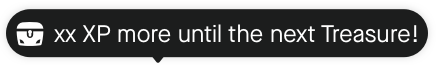
This component is used above the GoClub Progress bar and is used to denote the XP required for the next Surprise Treasure. It has rounded corners and a triangle notch which can be at left, centre, right or at any position depending on the surprise treasure XP value.
We built this component by implementing our custom Edge Treatment similar to TriangleEdgeTreatment. The pre-defined Triangle Edge Treatment draws a triangle notch at the centre of the edge, but we wanted the position of the notch to be customisable. So we built our own custom class which draws the notch at the any given offset value.
In conclusion…
It’s incredibly easy and quick to implement the treasure card and tooltip using the BottomAppBarTopEdgeTreatment and TriangleEdgeTreatment, respectively. Traditionally, we override the onDraw() method to draw our own path and it takes considerable amount of time to perform all the calculations. But, EdgeTreatment provides out of the box support for such shapes. Would highly recommend you to explore EdgeTreatment before implementing UI components having such non-traditional shapes.

To read more stories from the vault, click here. Oh btw, we’re hiring. Check out open job positions by clicking below: