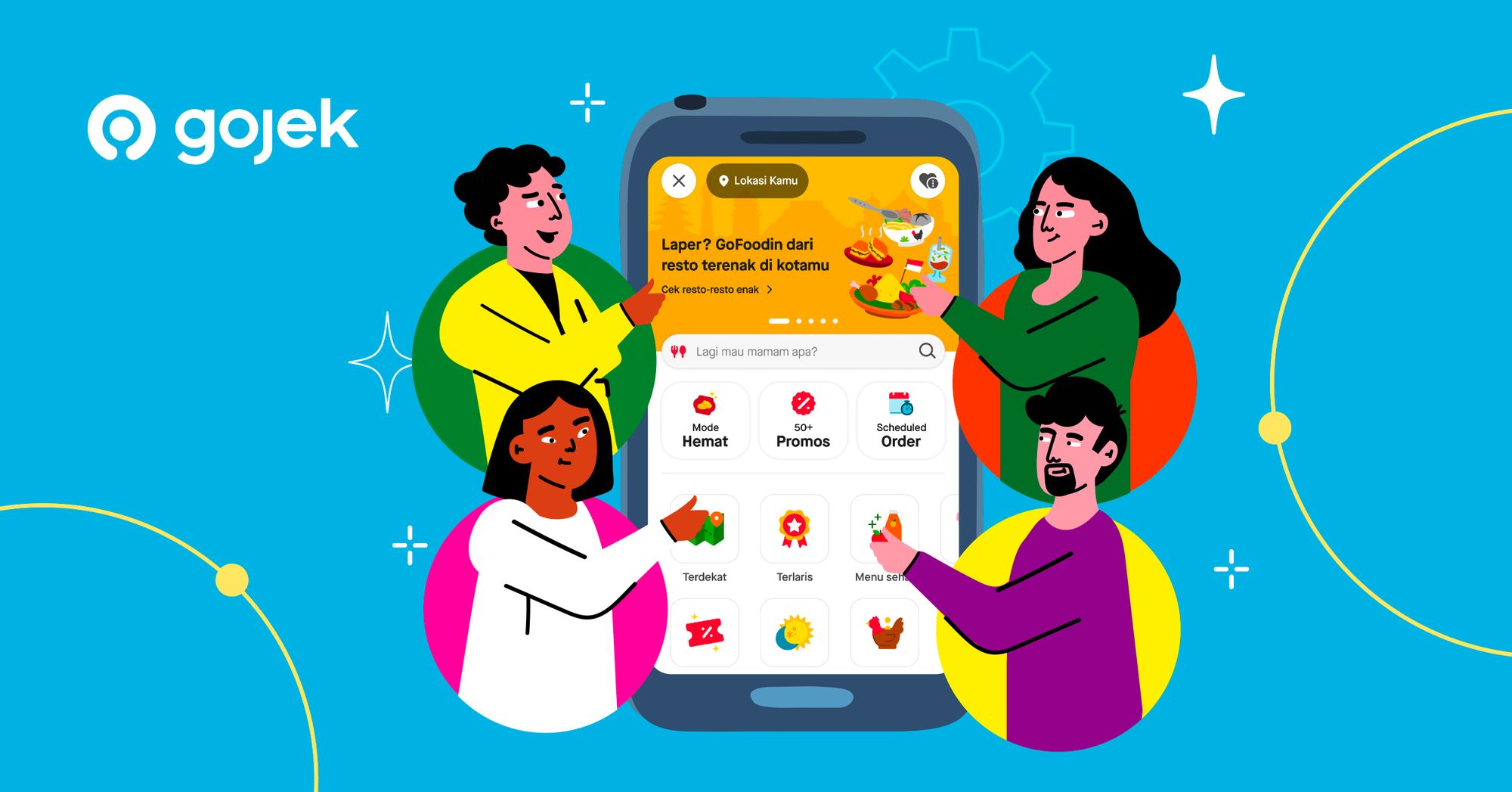
Appetizing Upgrades: Unveiling the New Features on GoFood Home
Bigger, better, and tastier design updates from Sep 2023!
By Anand Naik Banavathu
Introduction
At GoFood, our mission is to ‘Help the world eat better’.
The word “better” goes beyond just connecting customers with their favorite restaurants. It includes providing customers with better, diverse choices and at the same time tailoring to their preferences, tastes, and goals. It also means enabling better ways to order and eat food while ensuring we are an affordable, reliable, accessible, and fast food delivery service.
This mission drives everything we build at GoFood and this time around is no exception. We’ve updated our home screen with a fresh and modern design that aims to make the food ordering journey even more enjoyable and delightful.
The Design Process
At Gojek Design, teams mostly adopt a renowned industry design process called “The double diamond” design process.
In this process, the first diamond focuses on understanding the problem through research (Discover) and then clearly defining the problem statements (Define). We spent nearly six months focusing on user feedback, extensive user research, and defining clear problem statements.
The second diamond involves ideating solutions (Develop) and refining them to a final solution that is then executed (Deliver).
This process has allowed us to diverge in exploring ideas and at the same time converge on practical solutions. While we followed this process, our core fundamental philosophy was simple:
“Improve the experience, not just the page!”
Take note, more on the design process and the journey will be covered in the upcoming Part 2 of this article. For now, without any further ado let’s dive into the showcase.
Showcase 🥁
Before you scroll any further, a disclaimer that the rest of the article can induce cravings. So make sure you have Gojek installed.
With that let’s take a look at all the awesomeness we’ve delivered on the home screen this month.
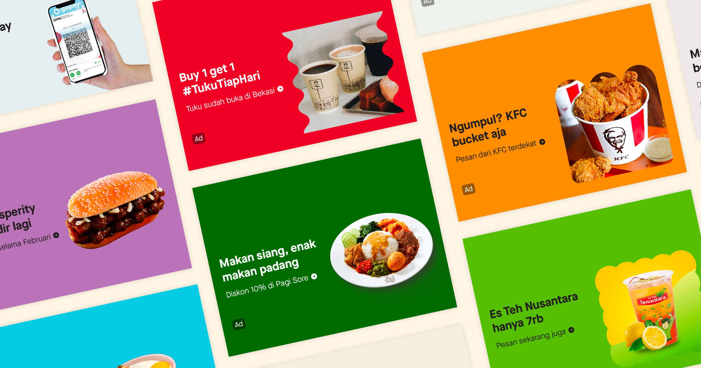
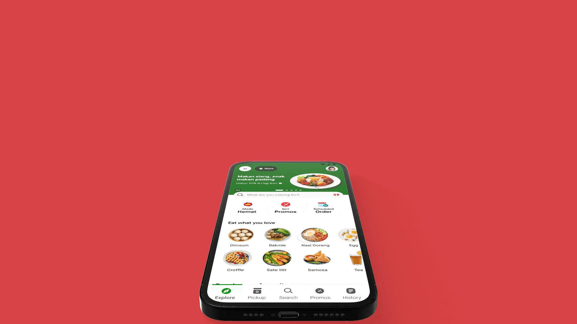
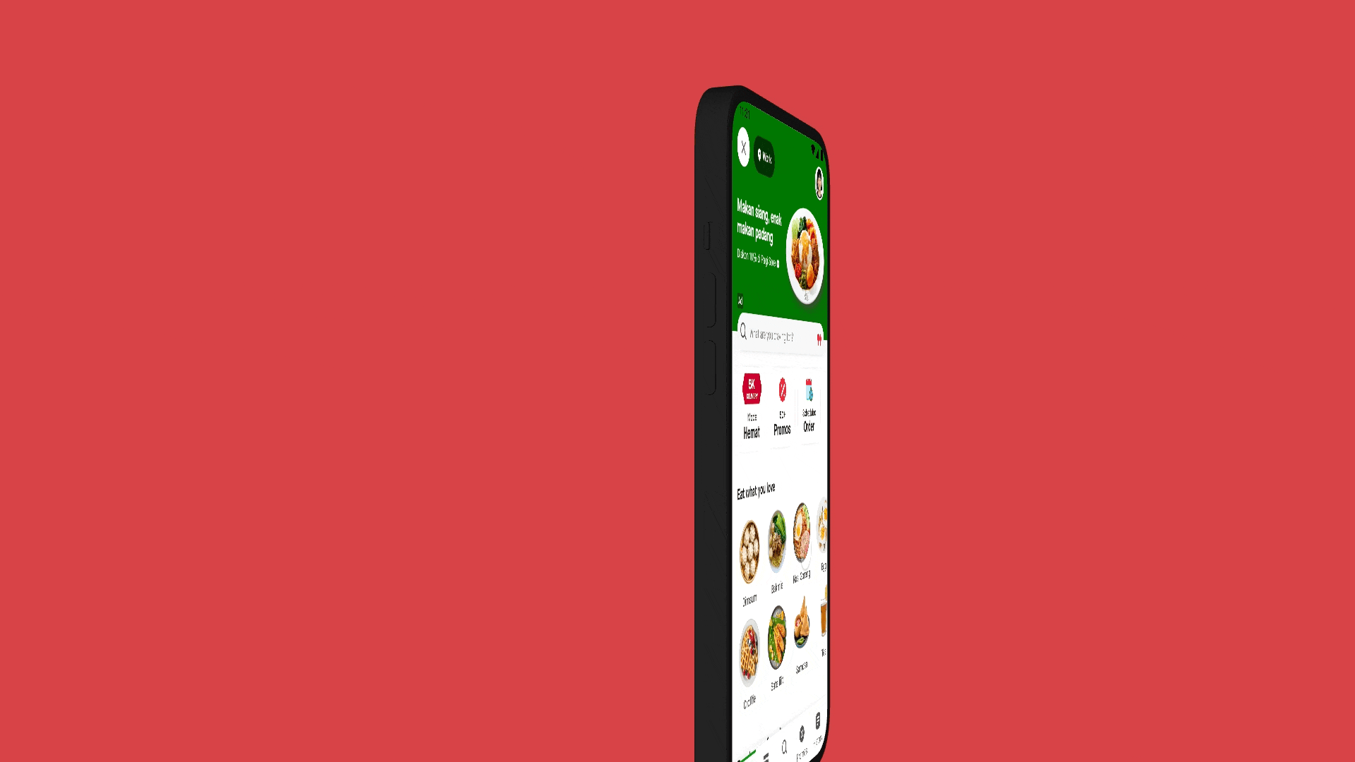
1. New Masthead Banner ✨
Banner carousel
The banner carousel on the home screen, helps users discover exciting promotions, exclusive deals, and new product launches from our merchant partners and internal GoFood marketing teams.
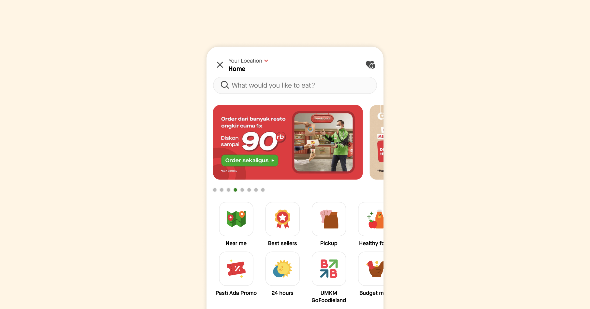
Through research and analytics, we learned that although the carousel banner occupies prime real estate at the top of the page, it garners relatively low engagement.
Through qualitative and quantitative studies we learn that:
- Banners are perceived to be limited to promo-driven communications
- Users don’t consider carousel banners to be useful and often tend to skip them. Partly also due to their mechanical habit of scrolling
- Too many banners, often considered to be irrelevant and not personalised leading to banner blindness
- Overload of information and busy design compromises readability and perceived value
To solve these problems, we redesigned our carousel banner and introduced a new masthead banner.
An all-new immersive, content-rich dynamic masthead banner.

We redesigned our carousel banner bearing these principles:
- Clear and Concise Messaging: Ensure the banner has a compelling headline that clearly communicates the message and offer. Keep the text minimal and impactful. Make conversations not ads.
- Rich, eye-catching visuals: To create visually rich compositions, we’ve refined our guidelines from the ground up. Ensure that only high-quality images, colors, and fonts are used to truly resonate with our brand identity.
- Don’t be boring: Enable support for more engaging media formats like videos, gifs, and Lotties. Create more engaging and content-rich banner ads.
- Relevant and targeted content: We now show banners specific to a target audience segment. Each audience segment understands user needs, interests, and preferences.
With the new masthead banner, we’ve seen a 21% increase in click-through rate, the number of users who clicked and placed an order almost doubled, and the return on ad spend for merchants has increased from 2x to 4.5x.
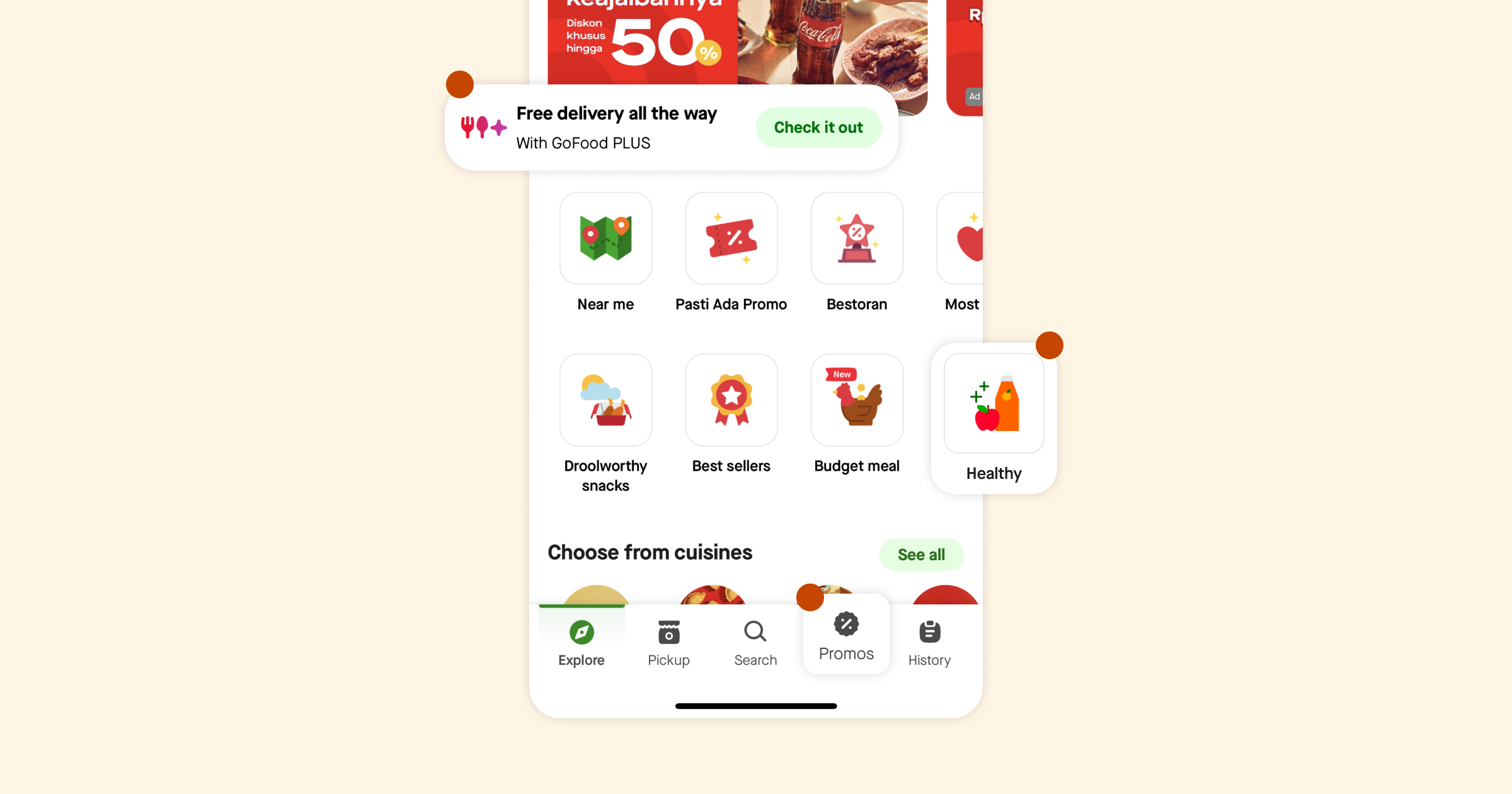
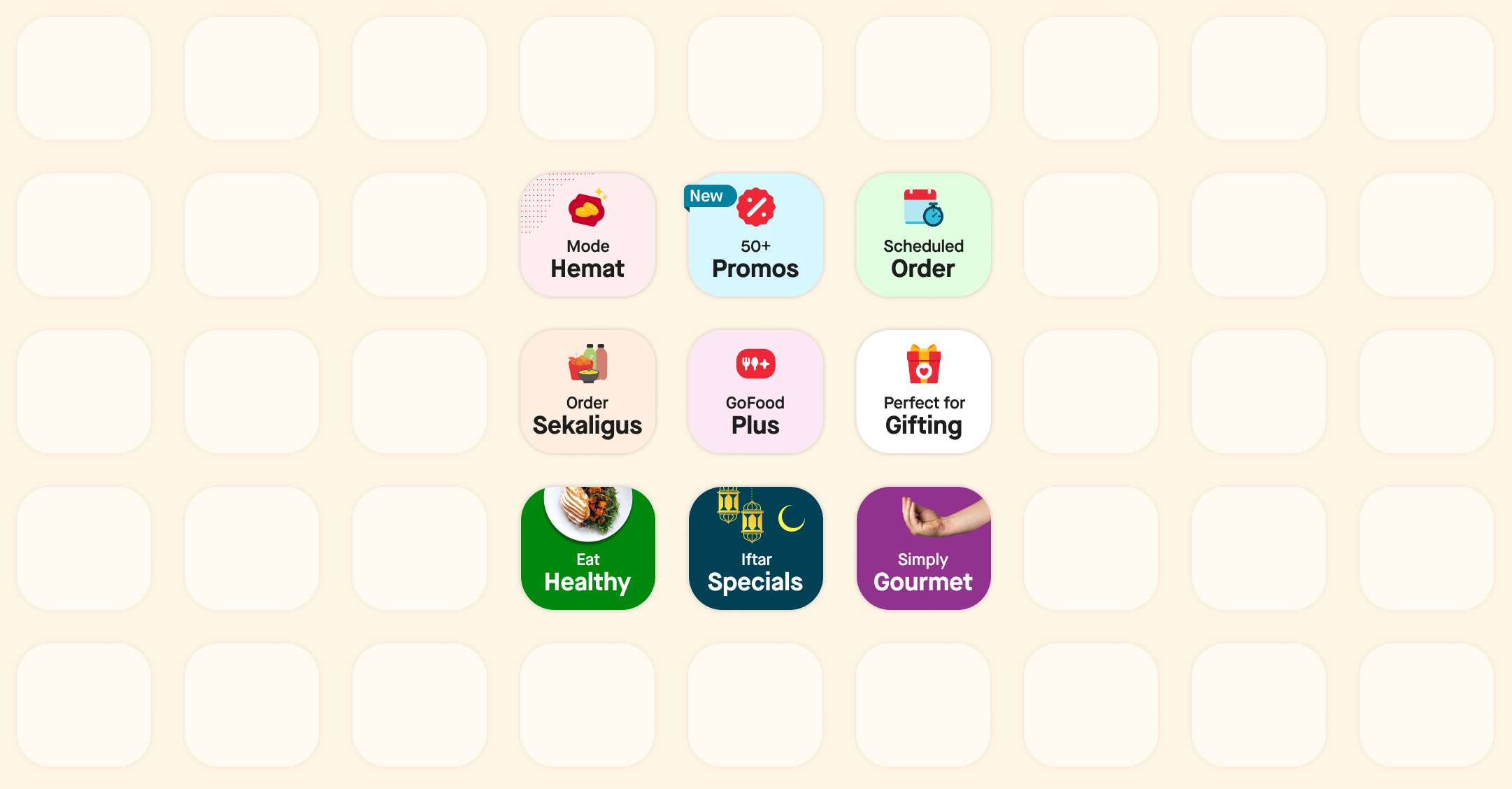
2. New Experience Bar ✨
GoFood modes
GoFood offers different ways to get food through modes. Modes help users discover and order food easily by providing end-to-end experiences that cater to different needs, requirements, and situations. Eg:
- Regular mode: Food delivery for convenience-seeking users willing to pay for a hassle-free solution to have their meals delivered from a wide range of restaurant options.
- Mode Hemat: Affordable food delivery for price-sensitive users willing to trade off speed and assortment for cost, made possible with efficient logistics.
- GoFood Plus: Subscription program for high-frequency users that unlocks free delivery on eligible orders at participating restaurants.
- Promo tab: A curation of restos running various promotions and discounts for budget-sensitive users who constantly seek value for money.
- Express Food: Food is delivered quickly and directly to your doorstep from the restaurant for time-and-quality optimizing users who are ready to pay more for speed.
Although, GoFood offers many different ways to source food we’ve identified multiple pain points:
- Users are often not aware of the different modes GoFood has to offer. Even if they do, they do not fully understand how different modes work.
- The discovery of modes is unstructured and scattered. There are multiple entry points that constantly change over time.
- Entry points to marketing experiences are limited. Eg. We saw that during Ramadan, users were not fully aware of where to find festive specials.
- Merchant carousels on the “Explore” tab are considered to be overwhelming for users, especially new users. They have been perceived to be outdated and “static” for years.
Bearing these in mind, we introduced the experience bar.
A persistent navigation bar on the home screen, that houses our key features and services. Upfront and loud.
Our principles were simple:
- Prominent navigation: Ensure that the navigation elements leading to the core discovery avenues are easily accessible and prominently displayed. Use clear labels and intuitive icons to guide users to the desired features.
- Feature highlights: Highlight our features and services on the main screen. Use visual cues, such as banners or graphics, to draw attention to these core services and provide a brief description or call-to-action to encourage users to explore further.
Oh, and our tiles also come in different colors and support Lottie animations.
Overall with the experience bar, we saw a 9% uplift in Click-through rate on the home screen and a 3% increase in Ads revenue.
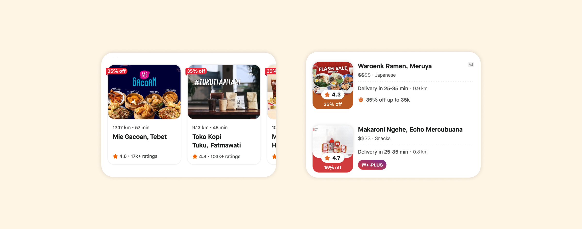
3. Merchant Cards 2.0 ✨
When listing restaurants, users expect to find essential and comprehensive information. Displaying restaurant name, photos, cuisine type, ratings, offers, and discounts, help users make informed decisions and narrow down on choice.
Data points like the restaurant’s location, ratings and review, delivery times, and serviceability helps set expectations and make it convenient for users to find nearby options.
Today, on GoFood we mostly use two merchant card layouts: The carousel card and the list card.
On the other hand, our studies indicated that:
- Promo badges are appreciated but repetition is considered to be confusing
- Users expect data points that indicate:
Popularity: Number of orders, reviews, trending or not, etc
Busyness: Length of the queue at the merchant to understand the trade-off on delivery ETA
Dietary preferences: Halal, Healthy, Vegan, Trending, etc. - The cover images are not legible enough. There is a lot of information related to promos, discounts, etc. that is added to the cover image by the merchants, leading to clutter, and users can’t read or understand what the image is trying to say.
- The meaning of the “$” symbol is not clearly understood and is not found to be useful
We redesigned our standard merchant card and introduced two new merchant cards — A full-width card and an exclusive merchant card.
- Primary data points: From our research insights, resto name, image, rating, distance, ETA, promo, price range & serviceability are considered key data points.
- Induce cravings: Resto image, name, and rating are considered the most important to consider a resto. Our data also shows that conversion is higher for restos with cover images. We ultimately sell food, lets show users food.
- Communicate serviceability: Give users clarity on the reason behind the delay whether it’s due to the merchant being unserviceable or no drivers found.
- Promo Highlights: Highlight different kinds of promotions, discounts, or exclusive deals the restaurant offers.
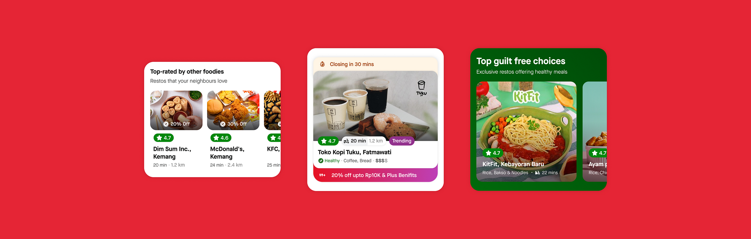
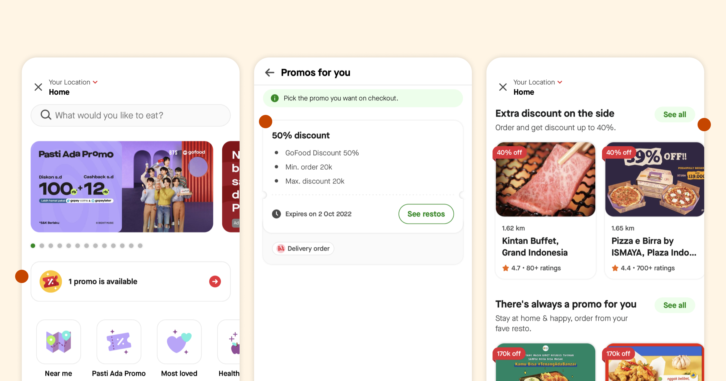
4. New Promo Zone ✨
Promos
One of the biggest reasons why our customers choose us (GoFood) over our competition is the promotions. Promotions help us acquire new customers, increase user engagement, and improve our overall sales. Running enticing promotions also helps us build loyalty, encourages return users, and helps our customers save a few bucks.
However, our research suggests that our promo perception and promo discoverability satisfaction can be improved. Our observations are:
- There are multiple promo touchpoints (the ‘Promos’ tab, Promo shuffles on the Explore page, ‘Promo Listing’ pages, and ‘Promo’ bar) which makes the promo discovery confusing, and redundant for users.
- Users find no difference in the ‘Promo’ and ‘Explore’ tabs with respect to finding promos. They don’t think of the promo tab when looking for promos, which was validated by a relatively lower CTR.
- Our data also suggests that almost ~88% of our users see only one promo on the “Promos for you” page, which leads to a lower promo perception.
- Only new users engage with the ‘Promo’ bar, indicating the page’s struggle in promoting valuable offers as and when they mature, supported by lower conversions from the page.
On the promo tab studies indicate that:
- The ‘Promo’ tab can have better resto curation that makes it easy to find relevant promos. Examples include “Restos on 50% off”, “Restos running free delivery” etc.
- Users feel there is no easy way to find relevant promos on the ‘Promo’ tab. Primarily associated with not having the ability to filter, sort, and search for promos.
- Users feel all shuffles on the ‘Explore’ and ‘Promo’ tabs offer generic promos, but not specific or relevant to them
Our primary hypothesis is that ‘improvements in discoverability, & explainability (awareness) of promos would help users find good promos easily and lead to a positive promo perception on the platform’.
With that,
We introduced ‘Promo Zone’, a renovated promo discovery and redemption experience.
Key features to look out for:
- Promo Masthead: Designed with a vision of showcasing the best of the promos to the user and helping in easy decision-making
- Section for you: Help users make decisions by showcasing what they love already and reduce any extra information analysis for them
- Shortcuts: Help user quickly move between the best promos running according to their needs.
- Innovation Hub: A complete experimental space for all different types of promos targeting different needs of the user. Eg.
- Flash Sales
- Cuisine Intent
- Payment intent - Infinite Promos: Don’t just end the page abruptly, rather engage users with a list of all restos providing promos with sorting/filtering
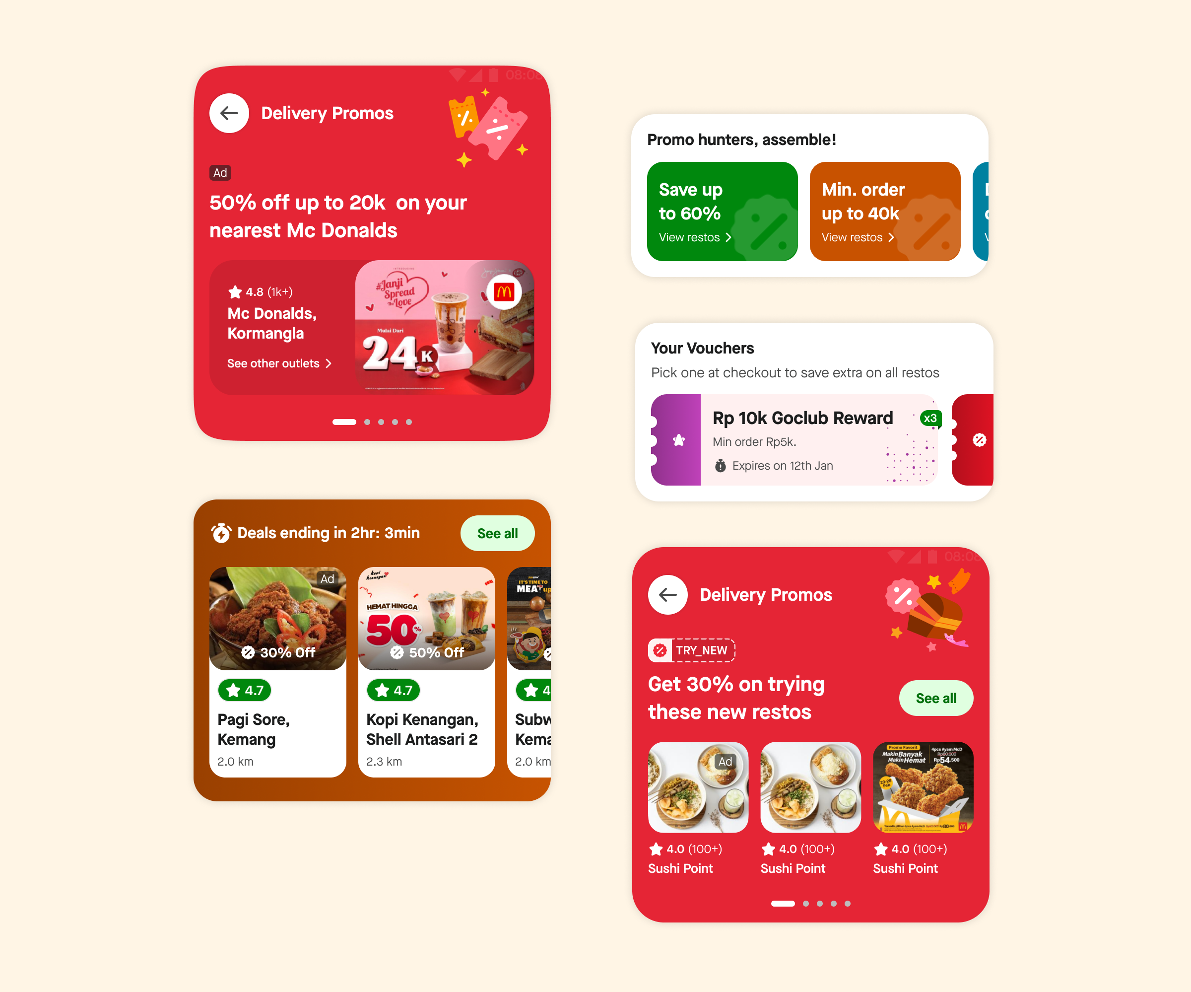
With the new entry point via the experience bar, visits to the promo zone have increased by 2.5x and the conversion of the promo tab has nearly doubled.
Conclusion
At GoFood, we’re committed to providing you with not only the best food delivery experience but also the most rewarding one. We hope you enjoy the convenience, variety, and savings with our renovated home screen experience.
Your feedback is always welcome as we continue to improve and optimize various features on the home screen and the rest of the journey. You can leave your feedback here.
Happy ordering!
The team!
A big shout-out to all the amazing teams at GoFood for coming together on this one.
Product design
User research
Creative design
Motion design
Content design
Design system
Design ops
Product management
Product ops
Business & strategy
Marketing
FE & BE Engineering
Data Science
QA
Lastly, the leadership team. ❤️

To read more stories from our vault, click here.
Check out open job positions here.