Accessibility & Inclusion: Building a #SuperApp for everyone
Here’s what we did to improve accessibility to our Android Components.

By Kiran Puppala
The Gojek Super App is used by millions of people every day. Our customers vary in age, gender, technical knowledge, and ability. Inclusion is a cornerstone that has made us what we are today. 💚
Building an app is just the first step, making it accessible to everyone in order to provide equal opportunities is where the challenge lies. That’s also precisely what makes an organisation more empathetic.
Developing an app with accessibility in mind ensures everyone can perceive, understand, navigate, and interact easily.
It makes the app usable for people with disabilities such as impaired vision, colour blindness, impaired hearing, impaired dexterity, cognitive disabilities, etc. In addition, an inclusive product is helpful in instances that occur due to external factors, like slow internet, low light situations, broken arm, etc.
The first step to achieving this is to ensure each small component of the UI is accessible. If they are…so will be the app. This blog details how we made our android components accessible.
We analysed commonalities between several components of our Design Language System and writing accessibility guidelines which should be met before developing a new component. We provided the implementation details and guidelines one can use to improve accessibility in their apps.
Grouping Views
Sometimes, it’s necessary to group multiple views under a single Container (a ViewGroup) and to be able to focus on one element instead of multiple elements.
Example: Order details, Song details, etc.
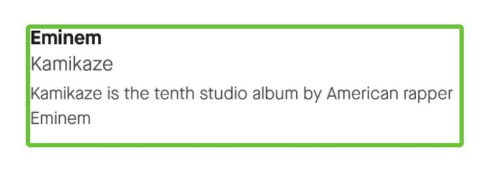
The below layout demonstrates the details of an Album.
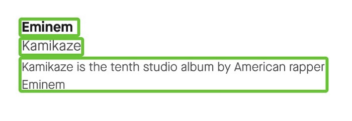
The above image depicts the details of the Album, represented as Artist, Album Title, and Album Description. Here, it’s all the more useful if all of them are grouped as a single element. By doing so, the screen reader will read one text after another in one go and eliminates the user’s effort to swipe right multiple times.
To achieve that, make the parent layout focusable by setting android: focusable = “true” or android:screenReaderFocusable= “true” (API 28 and higher) and set each of the child view's android: focusable = false.
Announcements
Announcements are crucial for users with visual impairments. To let the user know that a state change has occurred in a component or UI, it should be announced with the appropriate message. If not implemented properly, unnecessary announcements could annoy the user. Try to use announcements only when needed.
The state change to the talkback user needs to be shown in instances such as while showing/hiding the keyboard, showing a custom toast, showing an alert dialog, toggle button changed to on/off, etc.
Here is a utility method to make an announcement:
First, get the instance of Accessibility Service. Then, check if accessibility services are enabled on the device. Later, initialise the event with the class name and package name so that the screen reader knows for which element the announcement is being made.
Shifting focus
Shifting the focus of the element dynamically is not a good practice in terms of accessibility. It affects natural navigation which users perform in a linear manner.
Although, it is useful in some places. An example of such an instance is while showing a dialog card, where one needs to shift the focus to the dialog from the underlying view hierarchy.

To shift accessibility focus to any element you can use this method.
view.sendAccessibilityEvent(AccessibilityEvent.TYPE_VIEW_FOCUSED)
Describing elements
The least thing but rather more important thing one should do to improve accessibility to their app is providing a label to elements.
Components like TextView describe themselves through their text. But other components like ImageView, EditText should be provided with some meaningful labels.
Every ImageView should have a content description set using android:contentDescription attribute.
For EditText, android:hint attribute serves as the accessibility label. On devices running Android 4.2 (API level 17) or higher, you can have a corresponding View object that describes the content that users should enter within the EditText element. This can be achieved by setting attribute android:labelFor of TextView to target EditText’s ID.
If a view exists only for decorative purposes with no useful information, set its contentDescription set to @null or for devices running Android 4.1 (API level 16) or higher set android:importantForAccessibility attribute to “no”.
Changing the label for the dynamic state of the component
Sometimes we’ll have to change the content description according to the state of the component.
For example, a button might have to change state from normal to loading state, or a progress bar's content description should be changed as per its progress.
In these cases, we might want to keep the original content description intact but only change during state changes. When the state gets back to normal, revert the content description.
Here, whenever the button gets focus and if it’s in a loading state, change the content description to “Loading”. Keep in mind that it won’t change the content description of the button, it just modifies the event information. If the state is not loading, it will just read the original content description of the button. This can be applied to any component.
Changing the accessibility role
While creating custom views that serve the same purpose as similar native views, it’s better to provide the same role since users are already familiar with those names.
If your custom Button component serves the same purpose as Android Button, you can give it the same role as Android Button. The same applies to a Toggle component, which is Switch in the case of native android.
To change accessibility role, override getAccessibilityClassName() method of View class.
Renaming click actions
Whenever the user focuses on a view that is clickable or has onClickListener attached to it, by default the screen reader will read the content description followed by the action message “Double-tap to activate”.
To make it more contextual, you can alter the click action message. For example for an Add button instead of “Double-tap to activate”, you can rename it to “Double tap to Add”.
To do that, we need to change the action label in the AccessibilityNodeInfo of the button.
Removing click action information (like Double-tap to activate)
Clickable elements do not always have some action attached to them. Sometimes we make certain views clickable only because we want to make certain elements non-clickable.
For example, the parent view of a Dialog Box clickable just to make the items underneath non-clickable. In such cases, since the view is clickable, screen readers give a false message to users such as “Double-tap to activate”, which it shouldn’t do in this case.
Every view has accessibility node info and accessibility services use this information to decide what to read when a particular element is focused.
If a view is clickable, AccessibilityAction.AccessibilityActionCompat.ACTION_CLICK is automatically assigned to the view’s accessibility node info.
In order to disable that message, we need to change two things in the view’s accessibility node info.
1. Remove AccessibilityAction.AccessibilityActionCompat.ACTION_CLICK action
2. Set info.isClickable to false. (Note: The view will still stay clickable)
Do not remove click action information for a view that has click action to be performed (like a Button).
Recipes
Handing components like OTP input fields
Often we ignore/have poor accessibility implementation for OTP Input Fields.
An OTP input field has the following elements:
- Text Label
- EditText
- Timer
- Retry Button
- Helper Text
To improve accessibility for an OTP or input fields with timers, we need to ensure:
a. Linear Navigation 🧭
The user swipes left to right to visit one element after another. So, we should keep the navigation in this order:
TextLabel => EditText => Timer/Retry Button => Helper Text
b. Announcing the timer ⏰
Setting labels for TextLabel, EditText, Helper Text, Retry Button is easy. But the timer is a bit tricky. Announcing the countdown of a timer all the time annoys the user. So we decided to announce the timer only when the timer is focused. When the timer is focused we read time left every ‘n’ seconds.
To know whether a view has an accessibility focus, one can use view.isAccessibilityFocused flag( API ≥ 21) or the below snippet to support all versions.
Accessibility to Notch Cards
Cards are expanded and minimised using swipe gestures. But, when TalkBack is on, swipe gestures become difficult for a visually challenged person. There should be other means to move the card. We decided to add this functionality to the notch.
When TalkBack is on, the card movement can be performed by double tapping the notch. Initially, if the card is in the collapsed state, the card direction will be upwards and double-tapping on notch moves the card to one point up. The card moves upwards until it expands fully. Then the card direction will be changed to downwards. Double tapping on notch moves the card one point down until it reaches collapsed state for a non-dismissible card, or dismisses the card in case of the dismissible card.
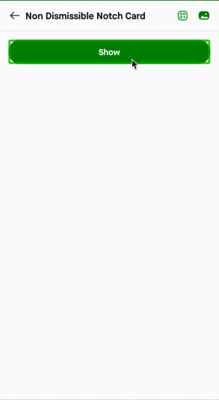
A card can have multiple snap points. At each snap point, we added the expansion percentage to the content description of Notch.
If the Card can be snapped to 10%, 30%, 50%, 100% (of its full height), at each position we update the content description of Notch. “Card control, 30%, Double tap to Expand (or Minimise based on the direction of the card)”.
Making custom keyboard accessibility experience just like a native keyboard. (Adding lift-to-type keyboard action)
While implementing an alternative to the native component, it’s important to keep the functionality as similar as possible.
In Android native keyboard implementation, even though the keys are clickable, users don’t need to double-tap on them to perform key action. Instead, the user can navigate by touch, and the name of the key is announced when the key is hovered over and key action will be performed as soon as the user lifts the finger from the key (or technically whenever a key hover exit happens). This action is called lift-to-type action.
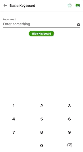
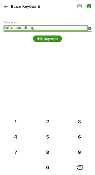
To give the same experience for the custom keyboard:
- Remove click action info for keys (double-tap to activate)
- Override dispatchHoverEvent method and perform a click on Hover Exit
Supporting Currencies
TalkBalk automatically speaks currencies whose symbols have Unicode characters. For example, the Unicode character of Indian rupee ₹ is \u20B9. But some currencies such as Indonesian rupiah (Rp), Malaysian ringgit (RM) don’t have Unicode symbols, so it cannot process them.
$1250000 is read as One Million Two Hundred and Fifty Thousand Dollars.
But, Rp1250000 is read as R P One Million Million Two Hundred and Fifty Thousand.
Here’s the workaround for this problem. For currencies with no Unicode symbols, one should prepend the Currency code to the actual amount and set it as a content description.
Let’s say, the order details are shown in a TextView. The display text would be “Rp1.250.000”.
textView.text="Rp1.250.000"
The content description is set as:
textView.contentDescription="IDR1250000". (IDR is the currency code for Indonesian Rupiah.)
This will be read as “One Million Two Hundred and Fifty Thousand Indonesian Rupiah” (assuming your System Language is English (United States)). If the system language is set to Indonesian (Indonesia), this will be read as “Satu juta dua ratus lima puluh ribu rupiah”.
For amounts with no fractional value,
Content Description = Currency code + Amount without dot or comma
For amounts with fractional values, let’s consider the two kinds of currency formats:
- Currency with (.) decimal separator and (,) thousands separator
Malaysian ringgit follows point decimal format and doesn’t have a currency symbol.
For the amount RM1,250.23, 1250 is the integer value, point(.) is the decimal separator, comma(,) is the thousands separator, 23 is the fractional value.
Here, Content Description should be set using the following format:
Content Description = Currency code + Integer Amount without comma + “.” + fractional value = “MYR1250.23”
- Currency with (,) decimal separator and (.) thousand separator
Some countries like Indonesia, Vietnam, etc., use the comma(,) as the decimal separator and point (.) as the thousands separator.
Let’s take the Indonesian rupiah as an example.
For amount Rp.1.250.000,91, 1250000 is the integer value, comma(,) is the decimal separator, point(.) is the thousands separator and 91 is the fractional value.
If the device language is English,
Content Description = Currency code + Integer Amount without dot+ “.” + fractional value = “IDR1250000.91”.
If the device language is Indonesian,
Content Description = Currency code + Integer Amount without dot+ “,” + fractional value. = “IDR1250000,91”.
Making an application accessible is an extensive area, and this blog covers the ones that are elementary. Feel free to contact me on Twitter for queries regarding accessibility implementation in an Android app, would love to help make products more accessible.

Looking to know more about how we build our #SuperApp? Check out our blogs.
To view open job positions, visit gojek.jobs.