A Tale of Two Designs — 3 of 3
A UX case-study on redesigning the GO-FOOD ‘Checkout’ experience | (Part 3 of 3) Back to the drawing board.
By Fatema Raja
This is the final part of a three-part series documenting the redesign of GO-FOOD’s Checkout experience.
The story so far: The GO-FOOD redesign started by showing some much needed love to the ‘Checkout’ flow (read about the problems in part 1 of this series). We moved from an overwhelming single page with too much information, to a more intuitive two-step design with a hope that the new design will help our users navigate the flow better (detailed in part two).
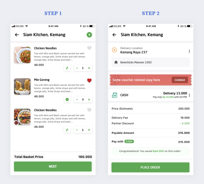
We rolled out the design to beta on August 12, 2018.
This is what our redesigned flow looked like👇
One week later:
A 10% drop in our orders!!🤬
That… did not go according to plan. 😬
But here’s the fun part: The app worked, and the bookings went through. No major out-of-whack tech issues. Yet, there we were, steadily losing orders.
Bugs? No.
Server issues? Nope.
Downtime, then? Nuh-uh.
After many such questions and no answer, we were left with just one conclusion. 😭
The design change had made things worse.
Just when I thought my job was done, I realised it was only the beginning. For I knew, no solution was good enough until users were successfully using it.
Strap in, we’re in the Endgame now 😅
Prior to launch, we had rallied the team around a common definition of success — one that was quantifiable and easily measured. 10% drop in our orders did seem tragic, but we knew looking at a single metric wasn’t going to give us the full story.
Hence along with defining success metrics for our overall conversions, we also defined and tracked metrics for the smaller tasks, tasks that led the user to the final goal. This helped us monitor whether users were navigating through the flow as intended. As a designer it was important to not restrict myself to just wireframes and workflows, but participate and know these numbers inside out.
“Designers who are involved in setting success metrics are far better at driving impact than designers who are not”
— Julie Zhuo
Focusing on post launch productivity 🔥
When the overall booking rate dropped, we started digging deeper to find where the frictions were in the flow. We started sifting through the finer details and closely analysed the smaller tasks, the results were a bit surprising.
- By moving the location card to the top, our cancellation rate for
wrong address selecteddropped by 2% —First win☝️ - There was no significant drop in the notes or dishes added to the cart. Much to our relief, the new interface was intuitive, users were able to locate the notes button and other dish details— Second win ✌️
- Similar affirmative results with our payments and location card designs too — More wins! 🤘
- But, there was one issue. Most users who abandoned the flow, left it on the first step itself. Which meant nearly 8% of users did not even land on the second step of the redesigned flow — Big Loss 😟
Our sanest conclusion was to wait, and give our users some time to get a hang of the new designs. After all, old habits die hard. Thousands of our users who were previously used to a single step now had to break a solid habit.
Yes, the old design was unacceptable (well, in the designer world at least 😛). The new design — despite featuring enhanced UX — broke some habits for our users.
A week passed… then two…
Nothing changed. ️
After shuffling through tons of data, we found ourselves with a bunch of questions. Who were the users who abandoned their food at checkout? What were they thinking? Why would they do this?
To get these answered we coupled our quantitative data with some qualitative research — below are some crude user thoughts 👇
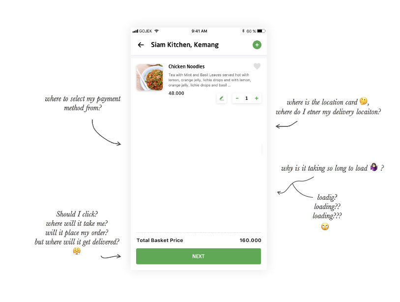
There were two major problems:
- Previously used to a single step, users weren’t prepared for a step 2.
2. Most users added only 1–2 dishes, and for them the blank white space meant loading. Resulting in high uncertainty and agitation 😓
Hence, most of them were reluctant to click on NEXT with the fear of placing the order — without them knowing the payment method or location 🙄
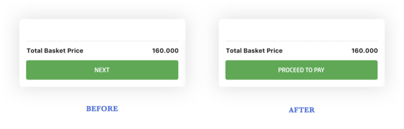
We were evidently drowning, but before we called for the lifebuoy, we tried to swim up ourselves. Not ready to give up on our precious designs, we decided to bring down the uncertainty by changing the copy on the button to Proceed To Pay. We hoped this would nudge users to realise there is a step 2 containing payment information.
Did it work? Did the uncertainty drop?
Much to our despair…nothing changed, no major impact. Neither were we able to bring down the booking time, nor were we able to increase the conversion rate. Not even close to what we anticipated.
Murder your darlings 💔😭
We had to be more open minded. If most of our users seemed unhappy with the design. we simply had to change it, Period ✋. It was time to hit the dashboards, analyse the problems, and form new ideas for improvements. With the growing numbers, one thing was clear, users wanted to bring back the single page.
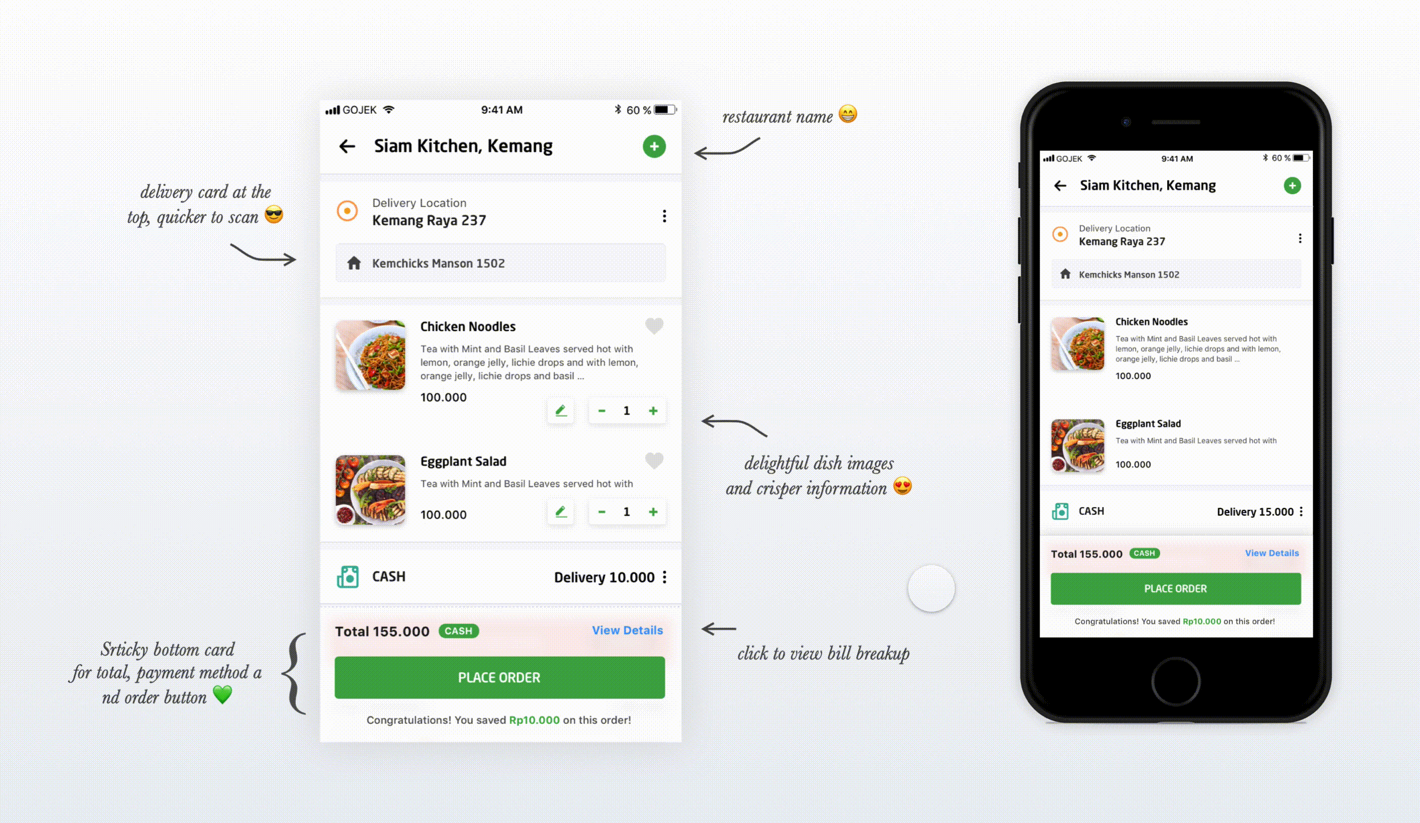
For our final solution we shifted from logic to emotion, focusing more on user’s thoughts and feelings at the time of ordering.
I asked myself, if I were a user and I had to know three things about my order, what would those be? 🤔 — Card sorting came in super handy
- Location Card — I want my food to come to me. I am hungry and the last thing I want is my food going to someone else 🗺. With a drop in the cancellation rate for
wrong address selected,we knew retaining location card at the top worked like magic. - Dish Card — If I am craving for a pizza, I better order the right pizza. Right below the location card was the dish card, helping users easily double check the dishes they added 🍕
- Total amount and mode of payment — Once I get my pizza, I don’t want to run around looking for cash. By sticking the total amount and payment method with the order button at bottom of the screen, we saved our users a long scroll. This also created a neat space to surface discounts and savings 🤑
The final design was a single page with all three important fields (location, dish and payment) above the fold and easily accessible. An example of how it worked 👇
These lightweight and progressive changes, helped our users cultivate new habits slowly and steadily, making the redesign bearable for them 😇
Shipping — Climbing back onto the boat 🚣♀️
We were finally ready to roll, no leap of faith this time!
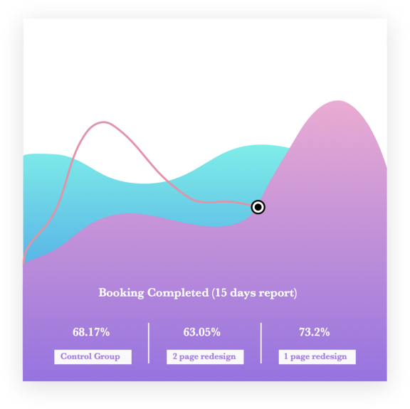
On September 5, 2018. We rolled out our final solution to ~50k users, without rolling back any of the previous designs. We now had three designs live with three different user groups.
- Group 1 — Control Group (users with existing designs i.e. long scroll)
- Group 2 — Two-step checkout redesign
- Group 3 — Single step redesign
Such a meaty chance to dissect and compare quantitative results. 😍 It helped me study and analyse the impact of all three designs against each other.
A day passed…
Then two…
Then a week or three later
We checked the data, ran the numbers, and validated our original hypothesis.
It had worked 🎉
The simplified single page was stabilising the order graph. Soon, our booking rate was moving north (obviously not in a dramatic way), but it had gone up by ~5% and we saw a significant drop in the booking time.
After enough validation, we incrementally rolled back the previous designs and moved all our users to the new designs one group at a time. And finally, the first piece of the GO-FOOD redesign pie, was baked to perfection. The sweet taste of success! (We like food puns, it can’t be helped! 🤷🏻♀️)
One part was over, designs were done!
Or were they?
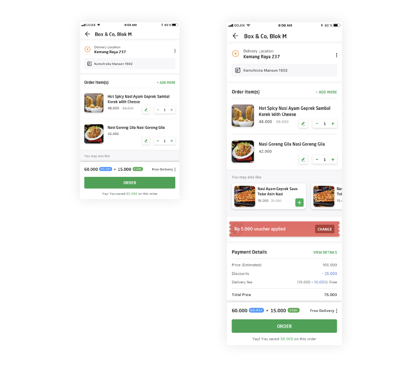
GO-FOOD is a fast-growing product, either adding features or enhancing current experience. Not a lot of time had passed after the design rollout, that the team decides to up-sell dishes on the checkout screen. It is interesting how (Sajesh Jose and Sugam Anand) are trying to fit yet another component on the checkout screen, here’s a glimpse👇
Design is a journey, not a destination ❤️
The idea is to keep measuring, learning and evolving, whether it is adding a feature or enhancing the current experience.
Design is in fact a continuous feedback loop that cajoles you into believing there’s such a thing as product perfection.
This series was a way to disseminate my most important learnings from the GO-FOOD redesign. I’ll leave you with a few key lessons learnt along the way:
If you fail: question it and fix it.
If you succeed: question it still, and make it better.
Iterate. Release. Validate. Repeat.
Fin.
(Special shoutout to Debayan Sen, Parveen Suhag and @geppegalih).
This series shines the spotlight on the work that goes in behind the scenes to build the GOJEK product ecosystem. For more stories like this one, follow us, and keep watching this space. We’ve got fantastic teams working on cool problems every day If that sounds like fun to you, visit gojek.jobs, and let’s get crackin’ 👍